All work was designed with Sketch, Photoshop, and Illustrator. InVision was used to prototype interactions and transitions. The fully responsive site was built using JavaScript, PixiJS, WebGL, GreenSock, Gulp, and Sass on the Riot.js platform with Contentful as the content management system.
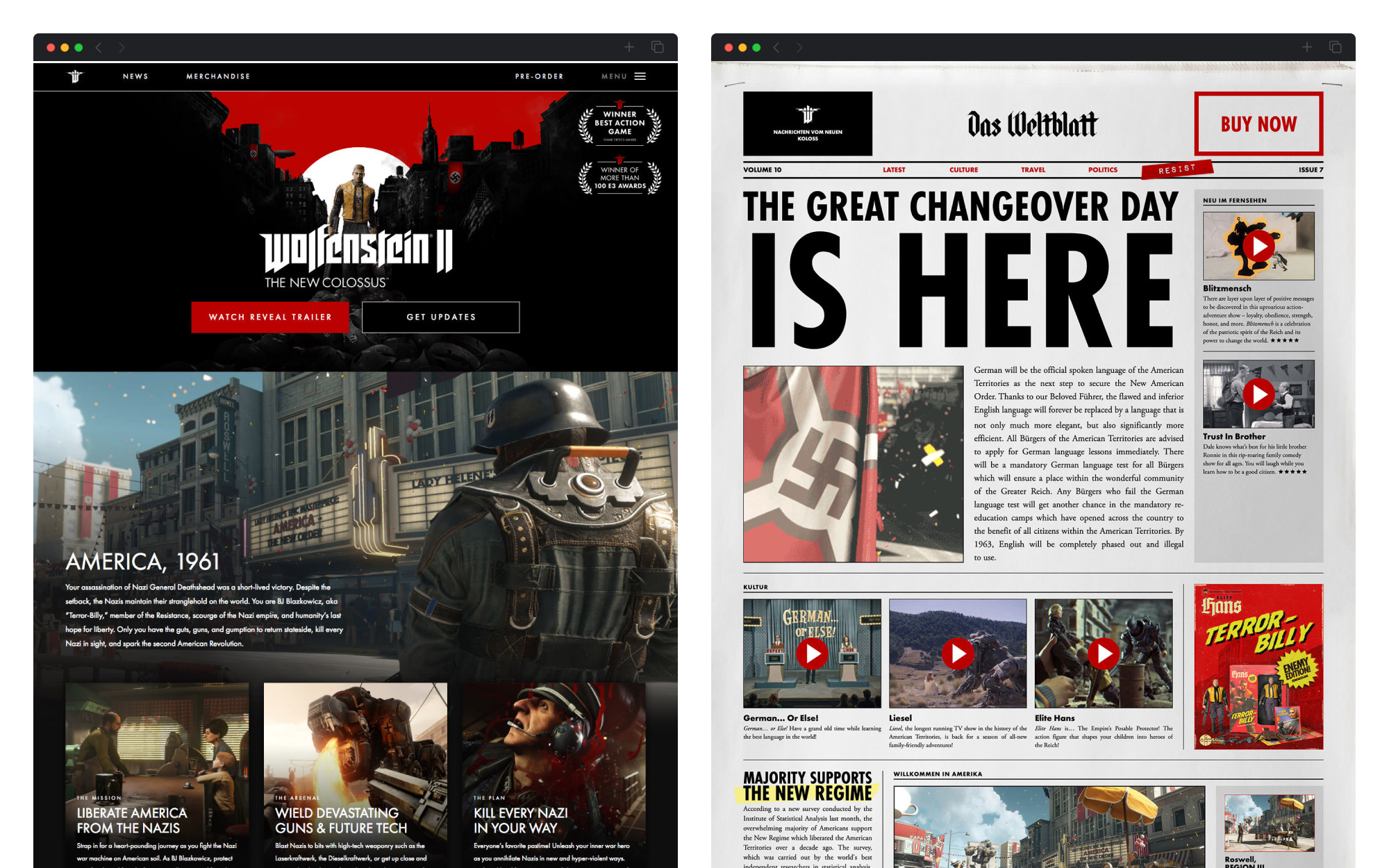
Ahead of Wolfenstein II’s E3 2017 announcement, nclud collaborated with Bethesda to create an immersive web experience featuring dynamic landing pages, interactive world-building elements, and complex multilingual support. The marketing web experience earned industry recognition and drove global engagement, growing beyond launch to support downloadable content add-ons and console ports.
Introduction
Reviving a legendary franchise with a bold vision.
Wolfenstein: known as the grandfather of first-person shooters (1992’s Wolfenstein 3D essentially invented the genre), it was also a pioneer in stealth-based gaming (1981’s Castle Wolfenstein also essentially invented that genre) and is one of the longest-running game series of all time, with releases and re-imaginings every few years since the original.
With 2014’s Wolfenstein: The New Order, MachineGames not only reincarnated the series but also created a compelling alternate universe to set the action in: a 1960’s Europe conquered by the Nazis (the perennial bad guys of the series) and full of colorful characters ready to join the fight and fight against. Garnering multiple Game of the Year awards and accolades, The New Order was a smash hit, leading gamers to ask “what’s next?”
Concepts
Redefining the web experience for a new era.
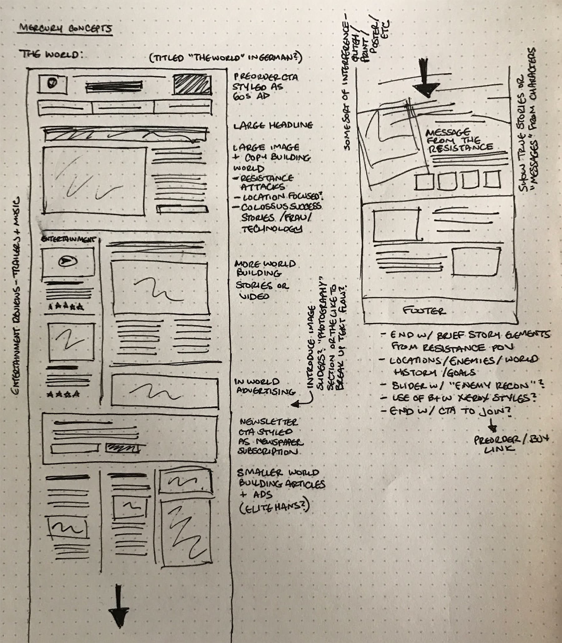
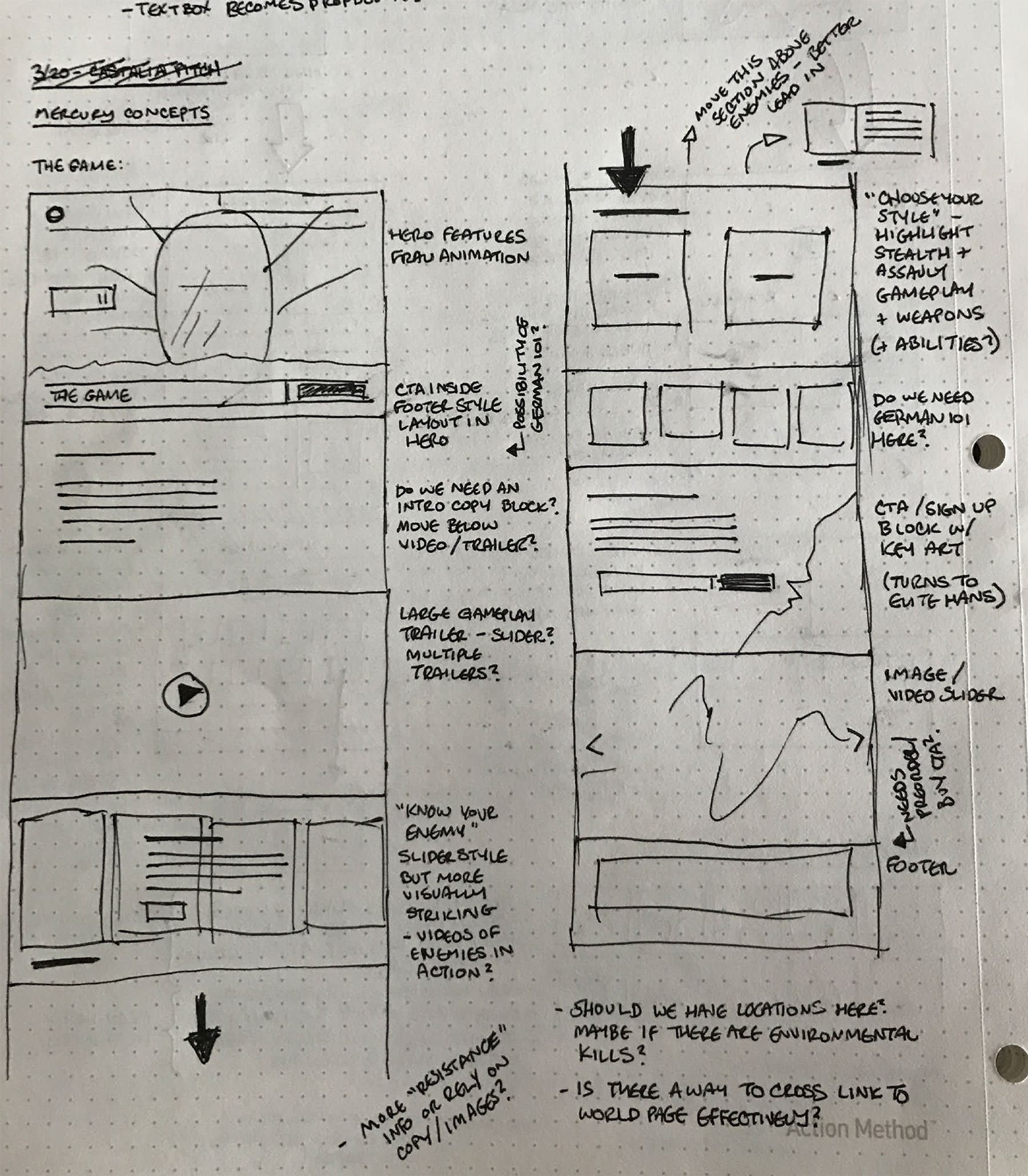
With E3 2017 on the horizon (and the much anticipated announcement for the next game in the series), nclud was brought in alongside the Bethesda Softworks marketing team to conceptualize the entire Wolfenstein web experience from the ground up. With the rise of social media and online gaming blogs, we knew we wanted to create an experience that would encourage visitors to explore the world of the game (and pre-order it) instead of just act as a dumping ground for press releases or desktop wallpapers.
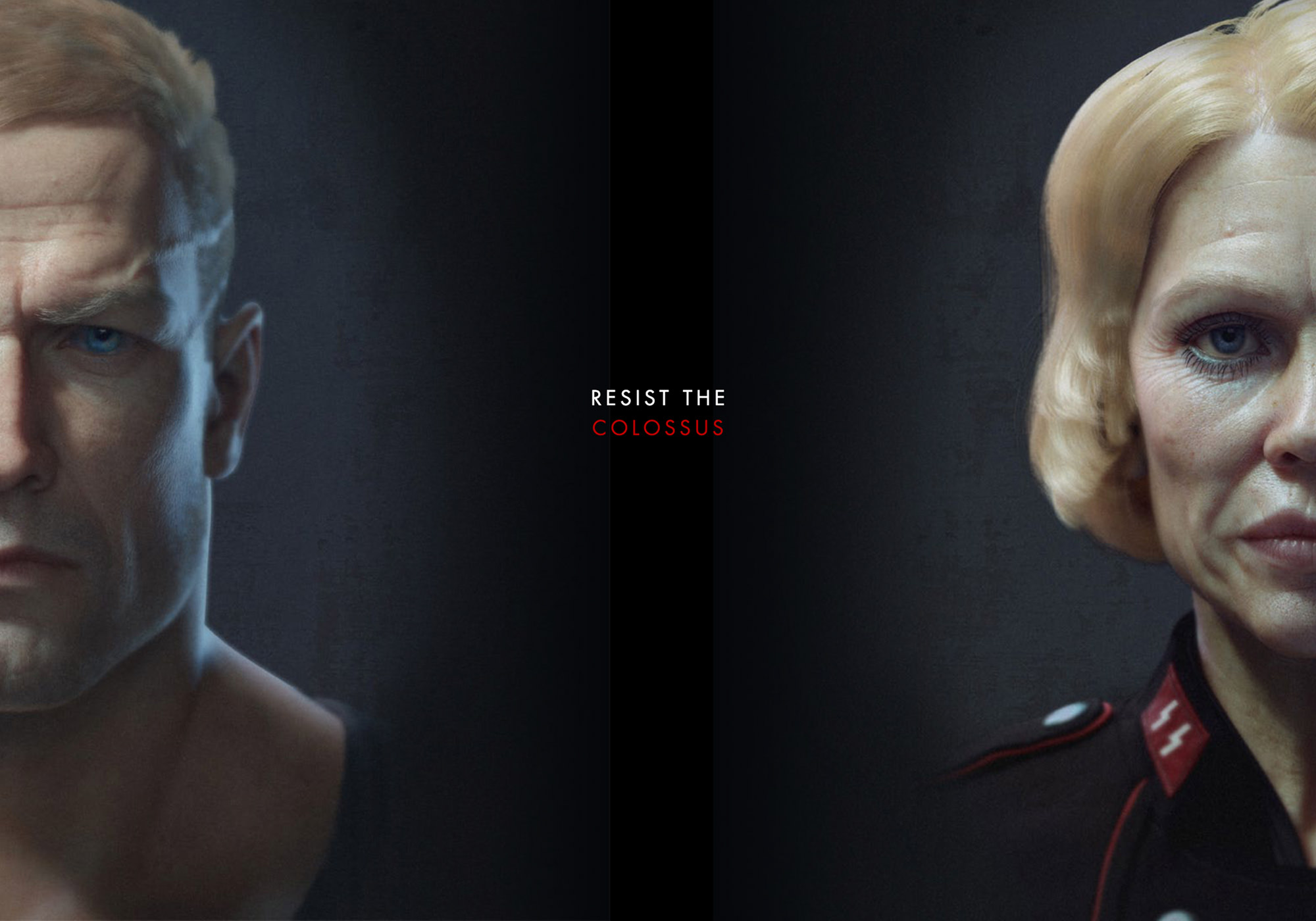
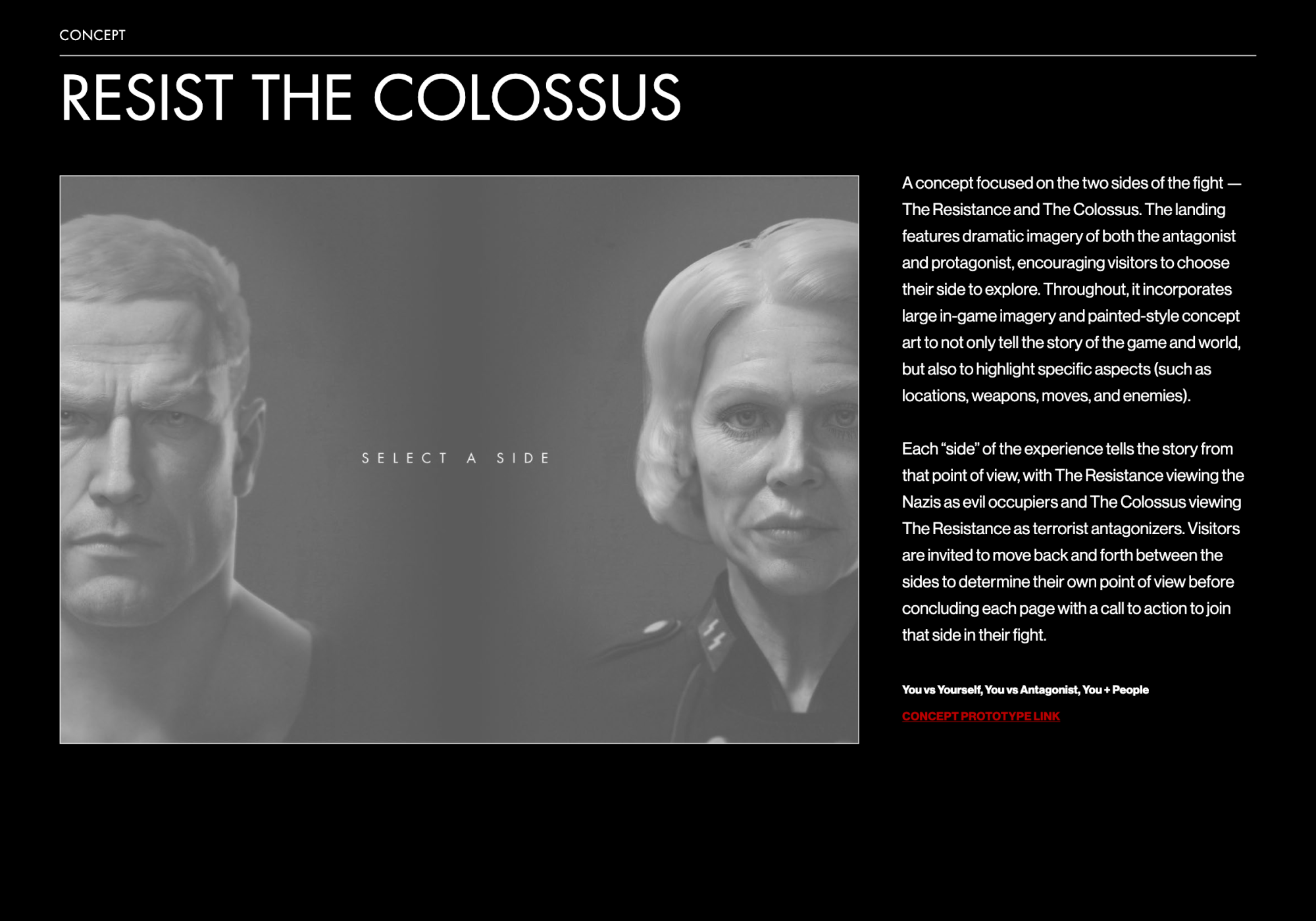
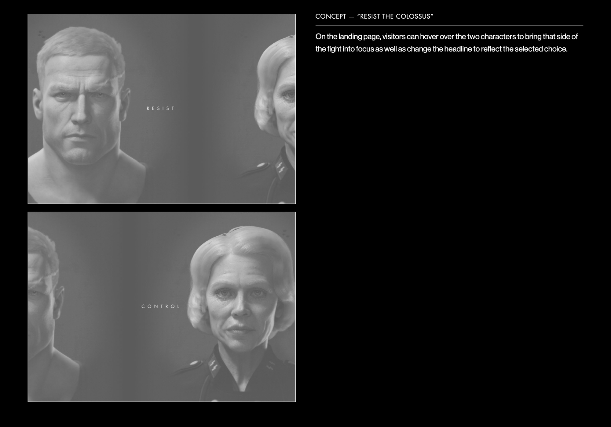
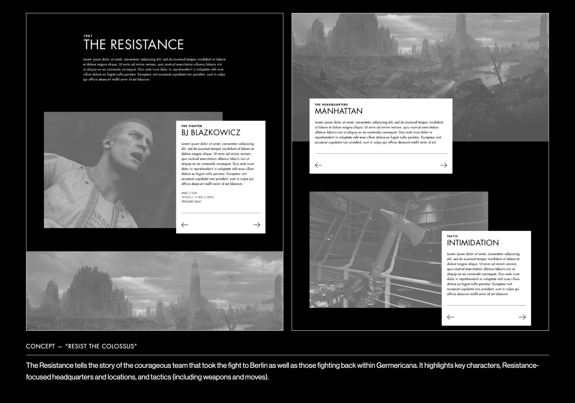
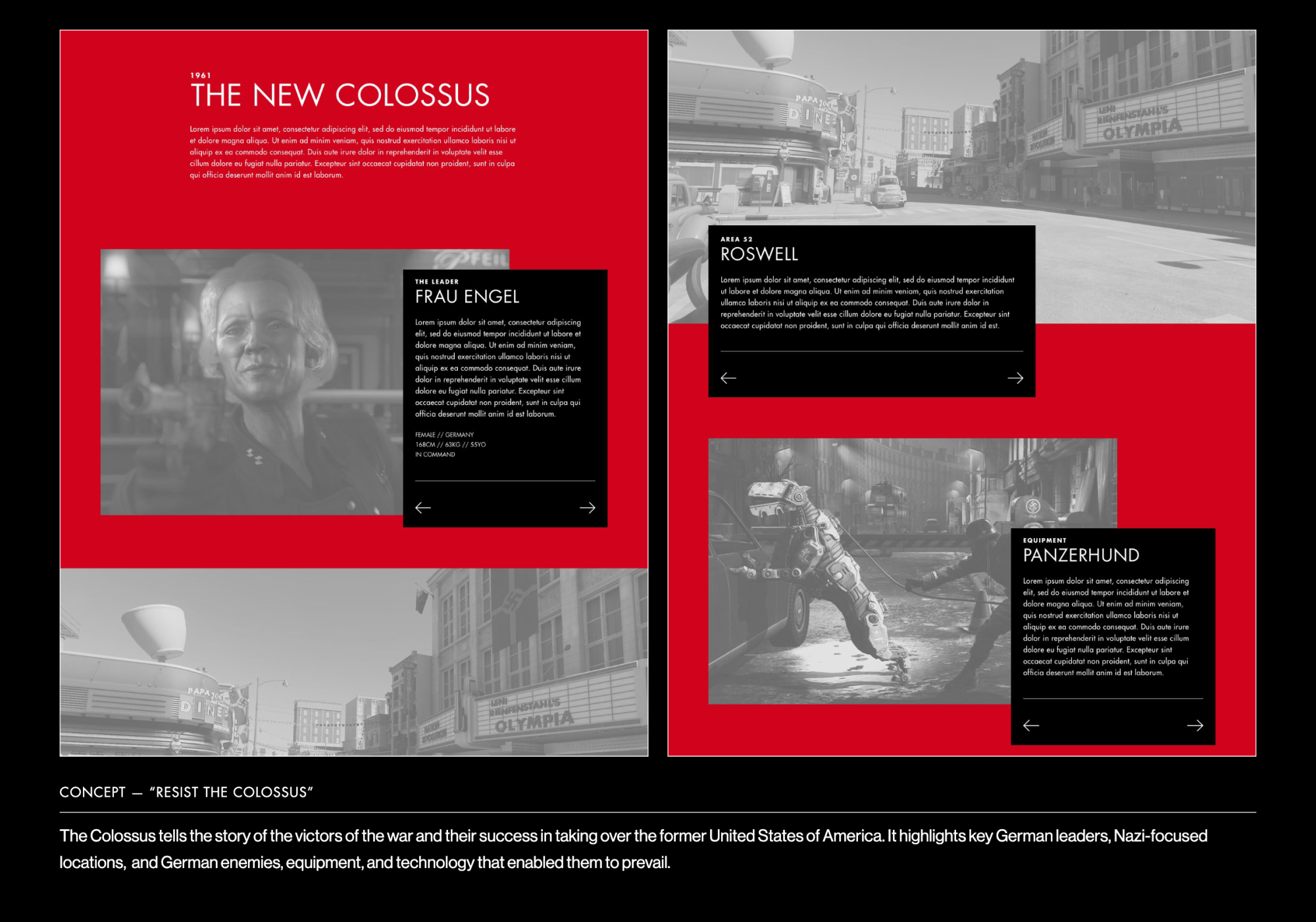
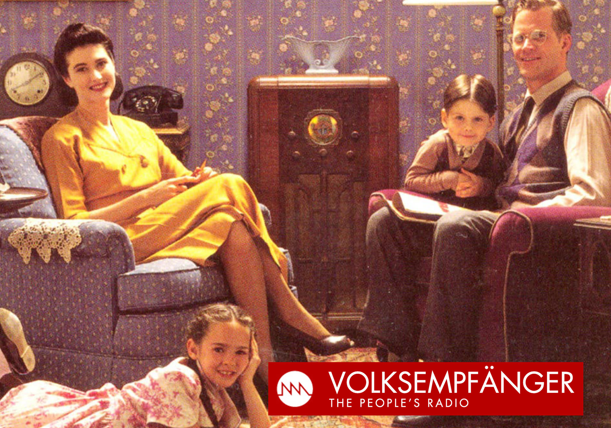
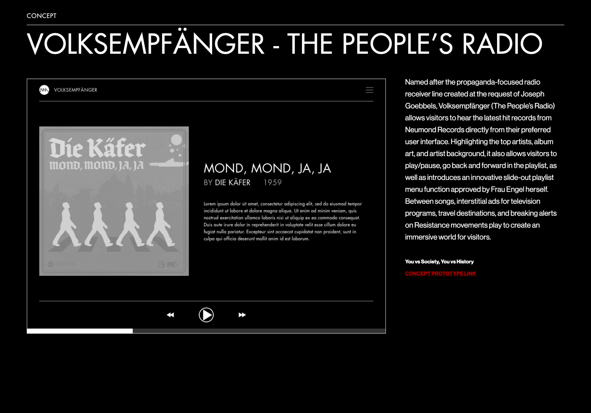
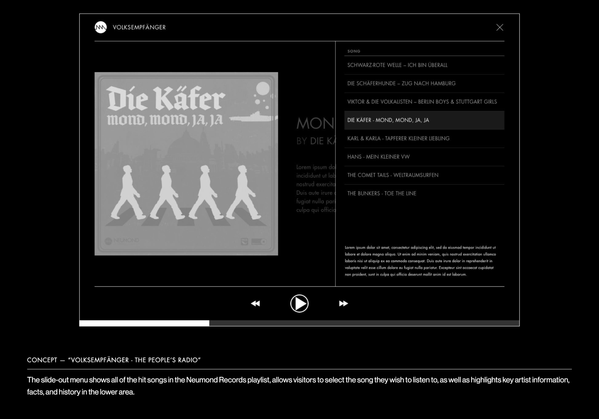
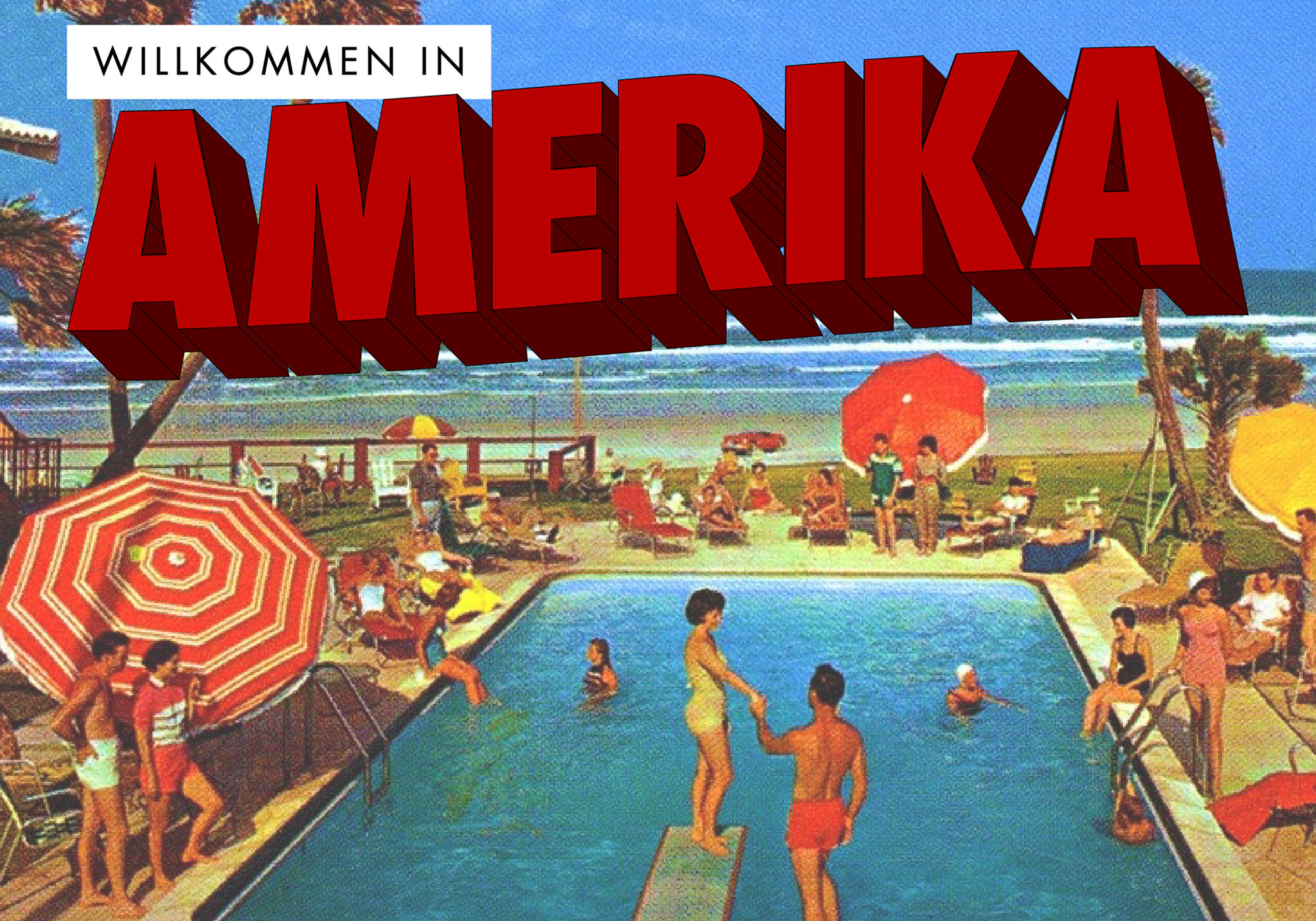
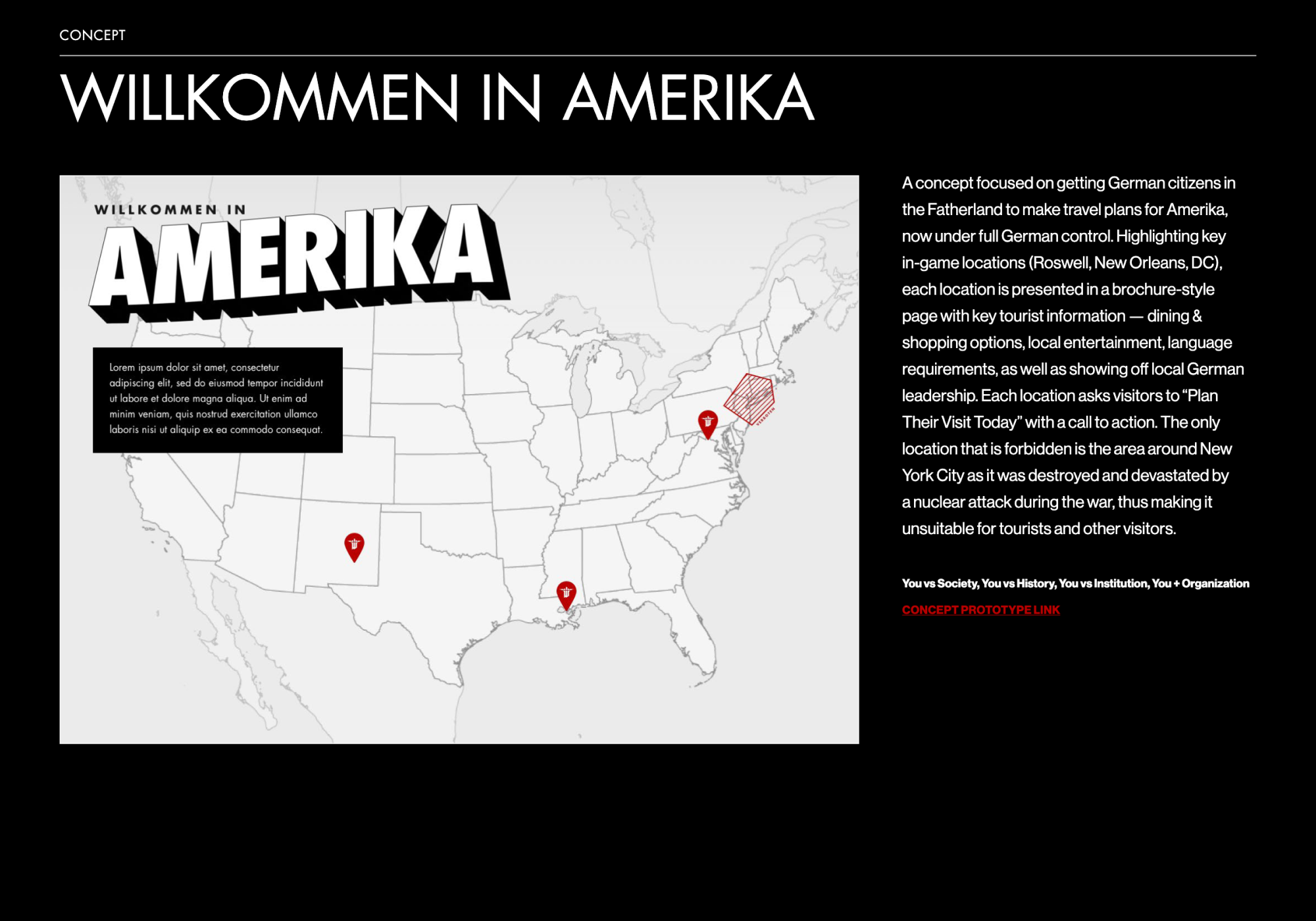
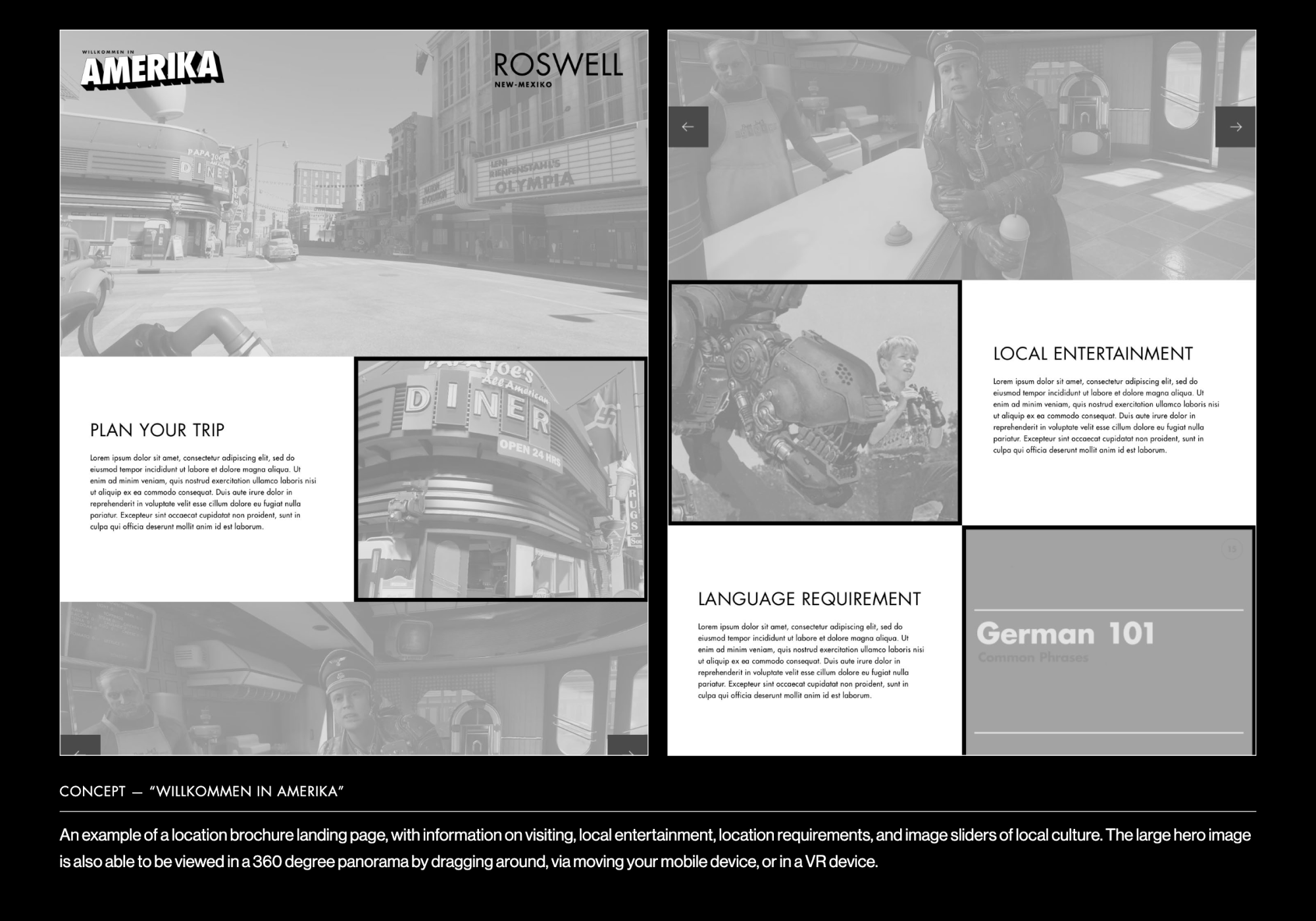
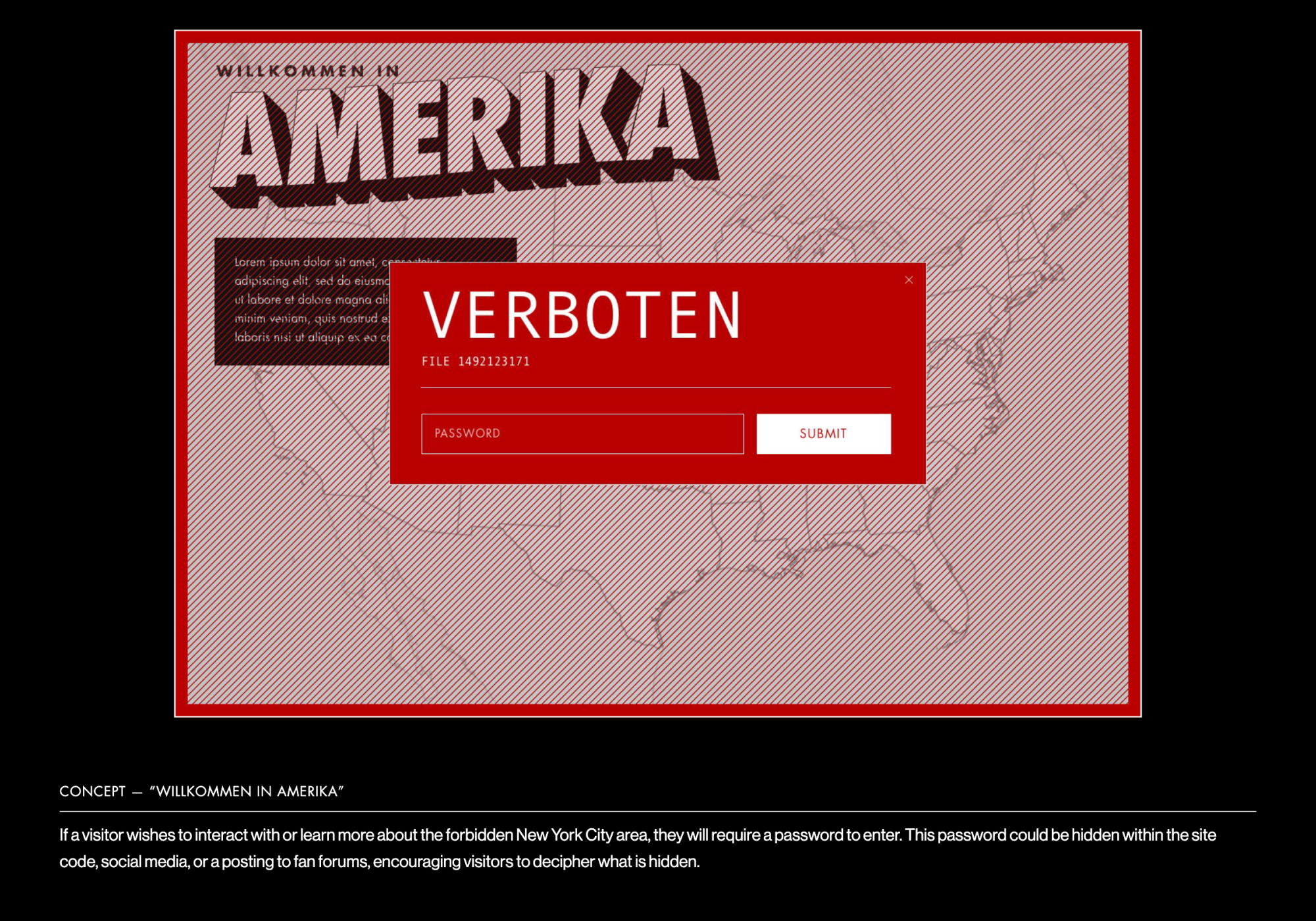
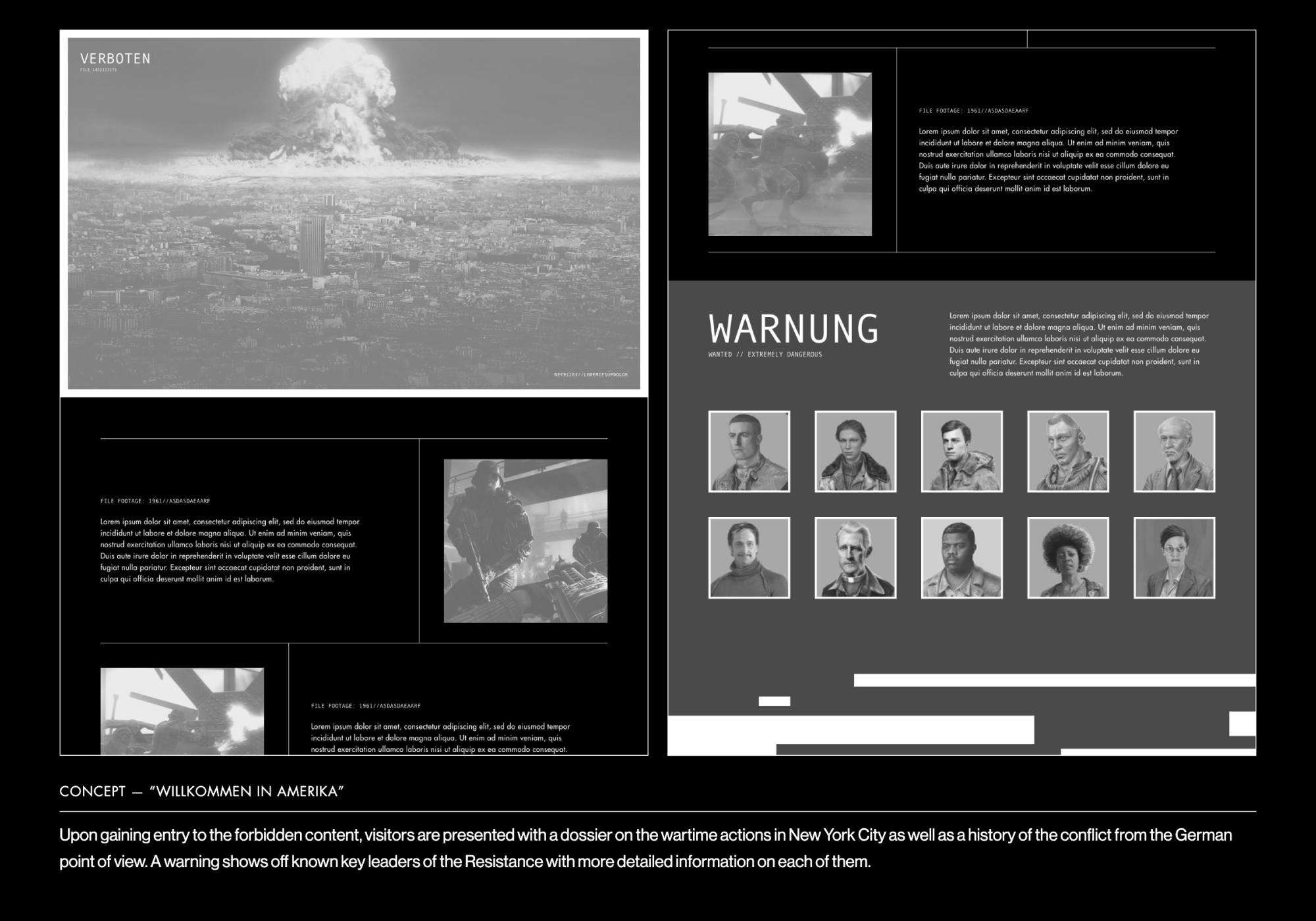
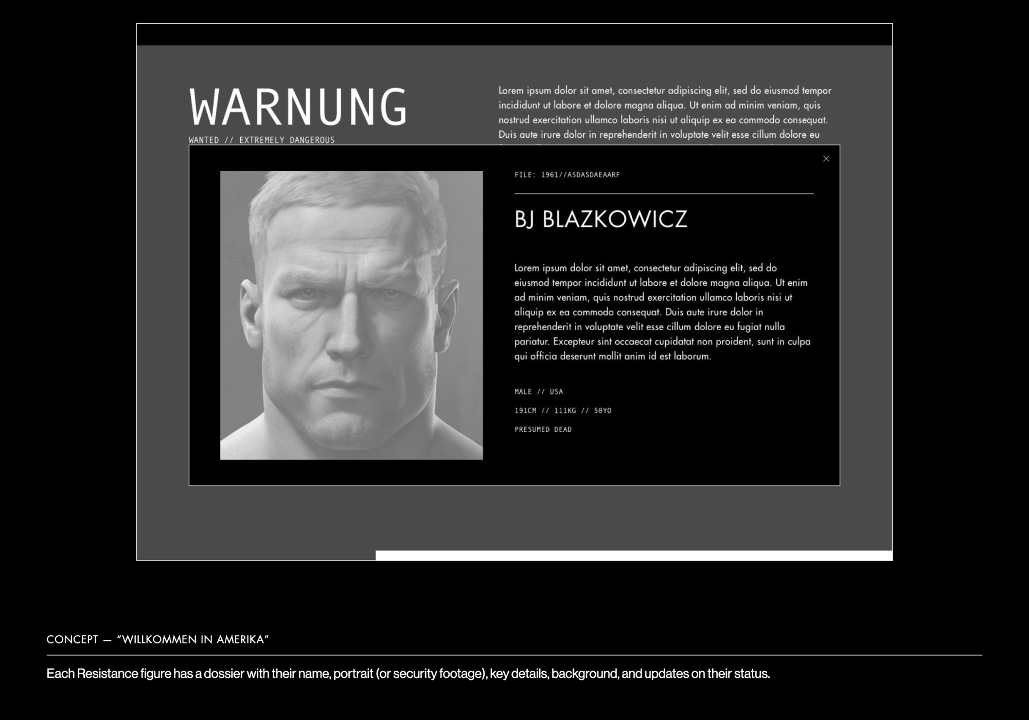
Starting with high fidelity concepts, we let our imaginations run wild and approached the experience from a variety of angles: what if we let visitors pick a side in the fight? What if we built a music player with songs from the alternate universe (including a German version of The Beatles)? What if we created an interactive map that highlighted “tourism” areas that mirrored the levels of the game?
Design
Crafting an immersive alternate universe.
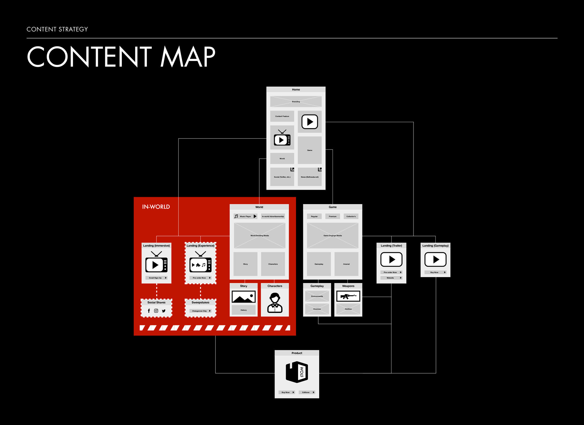
After condensing and stripping back the concepts, we had a path forward: a landing page that immediately told the story and set up the world of the game (as well as served as a repository for news items and trailers) and an immersive world landing page that fully explored the new setting: a 1960’s America that has been taken over and controlled by the Nazis.
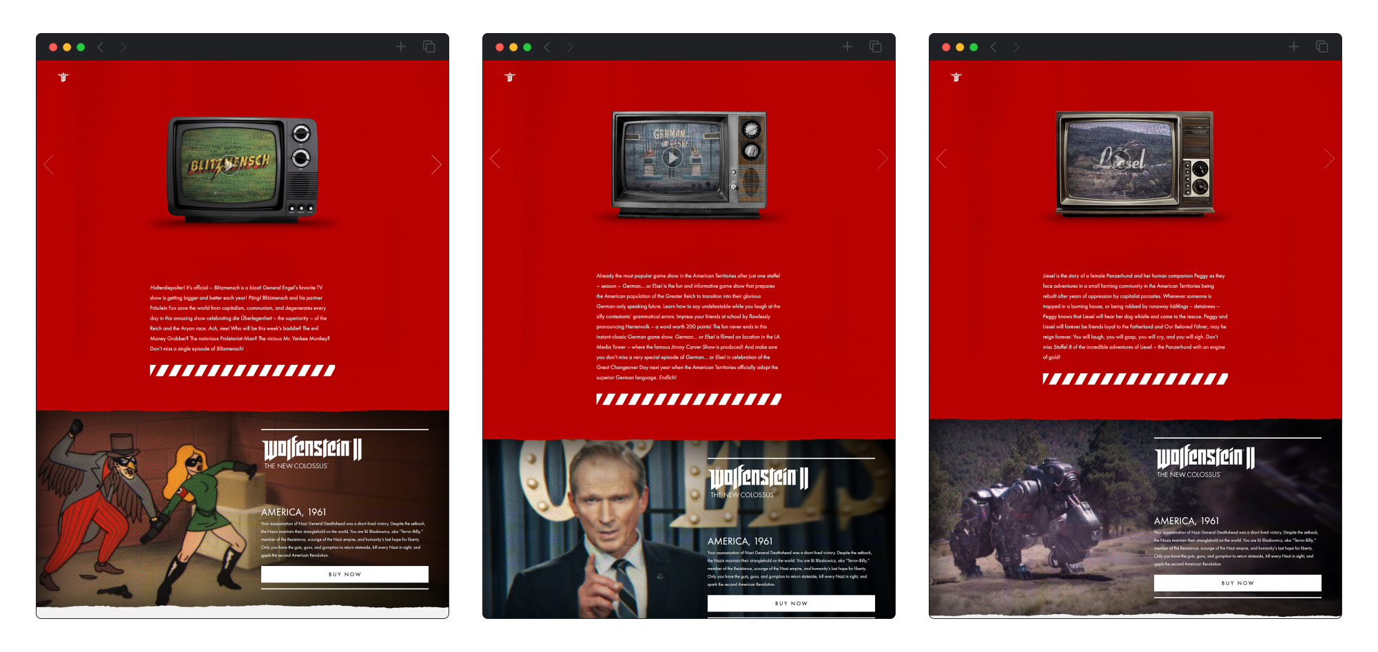
Alongside these major landing pages, we would also further explore the world with smaller connected landing pages, utilizing the in-world advertisements and television programs to tease more of the pop culture of this alternate universe.
Calls to action throughout drove visitors to a pre-order page, allowing them to learn more about planned downloadable content and select their platform and game package (including a deluxe edition that included a 12” replica B.J. Blazkowicz action figure in the style of retro G.I. Joe toys).




Strategy
Building a global and adaptive plan.
Throughout the process, we made sure to have a strategy in place for each segment that coordinated with the overall marketing plan. The home page grid was designed to grow and adapt from initial announcement to pre-launch to post-launch, with rules in place for content and information. The trailer landing pages went live weekly in conjunction with the marketing social media and advertising plan for each, to trickle out more information about the world and keep gamers engaged.
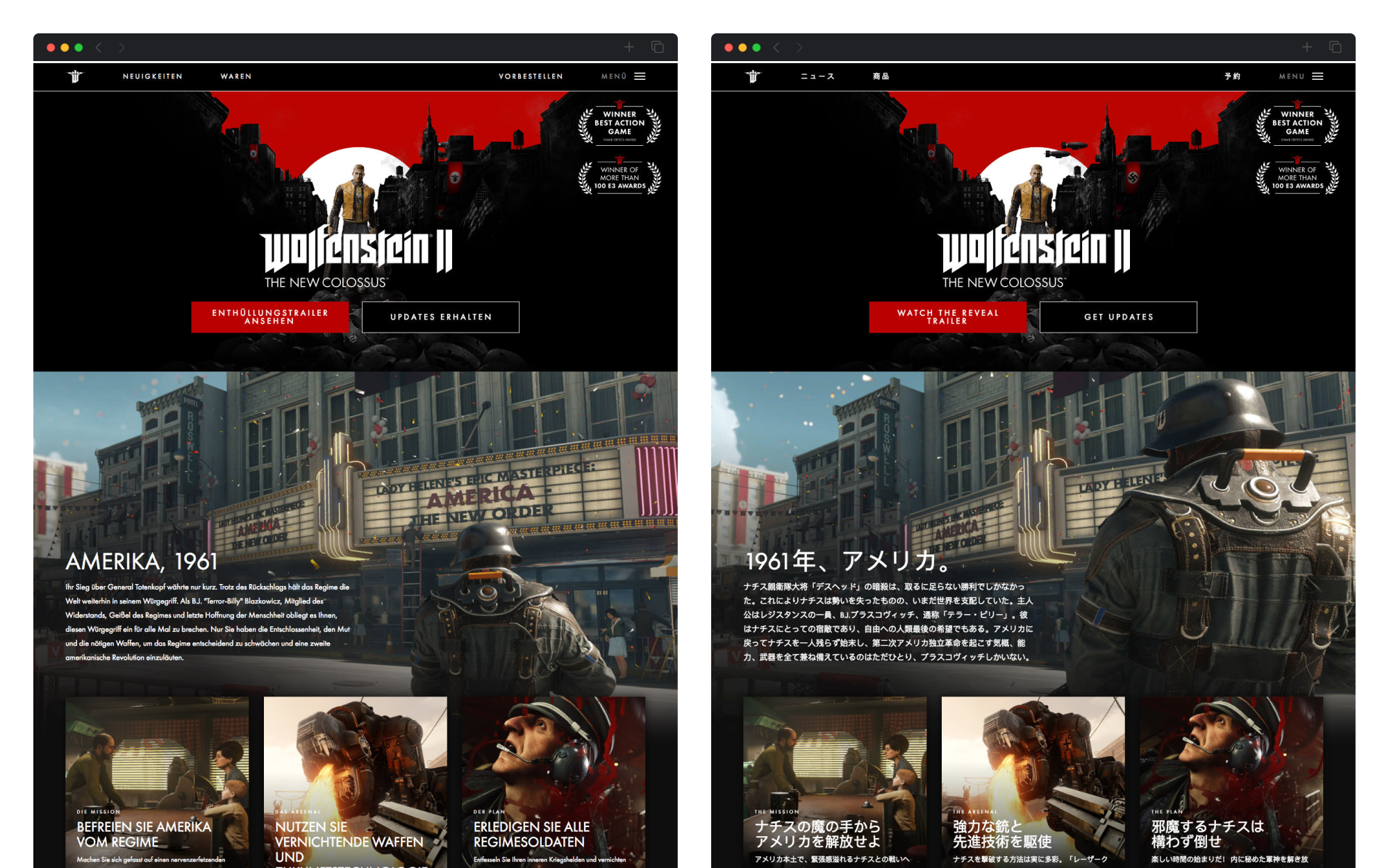
Special consideration was given to the age, language, and visual requirements: an age gate was in place across the site to ensure only visitors who were 18 (or could do basic math) could access; the site had to be able to accommodate ten languages (initially loaded based on visitor location), including languages using Chinese and Kanji characters; in Germany (and select other European countries), the depiction of Nazi imagery was strictly forbidden, meaning we not only used localization to develop a country-specific site, but we also created alternate assets across the board to ensure that those visitors were presented with a Wolfenstein-specific enemy logo instead of a swastika or Iron Cross.




Results
Launching to global success.
The Wolfenstein web experience went live at the same time as the game was officially announced at E3 (and global live streaming on all official Bethesda channels) with the slogan “Make America Nazi-Free Again.” The site was inundated with visitors from around the world desperately seeking to learn more about “Amerika” and the new world B.J. and his allies would be facing.
An immediate success, it continued to grow according to the content plan and beyond (including new home hero animations and post-launch pages for the downloadable content add-ons and Nintendo Switch port of the game). The Wolfenstein II: The New Colossus experience was nominated for Special Kudos by the CSS Design Awards.