All components were designed and built with Figma. The Chalupa plugin was built using HTML, Sass, and Typescript.
Taco Bell’s fragmented design process led to inconsistencies across platforms. By building a comprehensive design system, complete with a structured component library and plugin for real menu data, the team transformed product velocity, improved brand consistency, and gained widespread adoption across product, marketing, and creative teams.
- 1.2K+ components created across all platforms.
- 12K+ instances used every week.
- 552K+ instances used in the past year.
Introduction
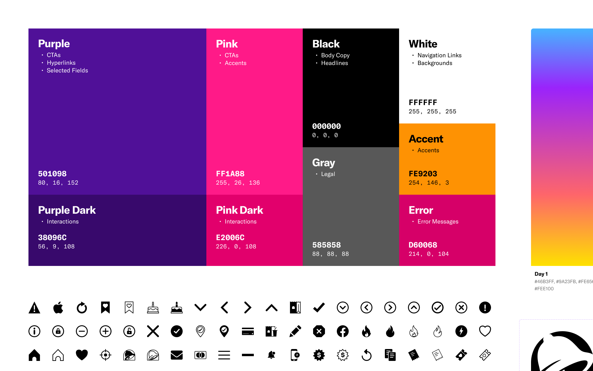
Twelve different shades of purple.
Historically, Taco Bell hired outside design agencies to work on new product features and limited time offers. Different agencies worked on different products with no unified vision for the brand, and work was completed and handed off in a wide variety of tools (including Photoshop, Illustrator, Sketch, and XD). That lack of unified vision meant every platform and feature looked slightly different, and even within a single platform things like buttons, cards, type, and colors weren’t aligned – at one point, the website alone was using twelve different shades of purple.
With Taco Bell investing heavily in building out and developing a full in-house product team, we knew we needed to bring organization and consistency to all products, features, and limited time offers. As we had aligned internally on utilizing Figma for all design moving forward (as well as collaboration with stakeholders and handoff to engineering), the solution was clear: we needed a design system.
Design System
Atoms and molecules and organisms, oh my.
Our first order of business was cleanup: with no formal brand or style guide, we needed some kind of definition for key brand elements like colors, logos, and iconography. We built the Brand library to do exactly that – anything cross-platform or cross-brand lives here, such as color styles, gradients, icons, illustrations, and even tool-specific components such as cover files and annotations.
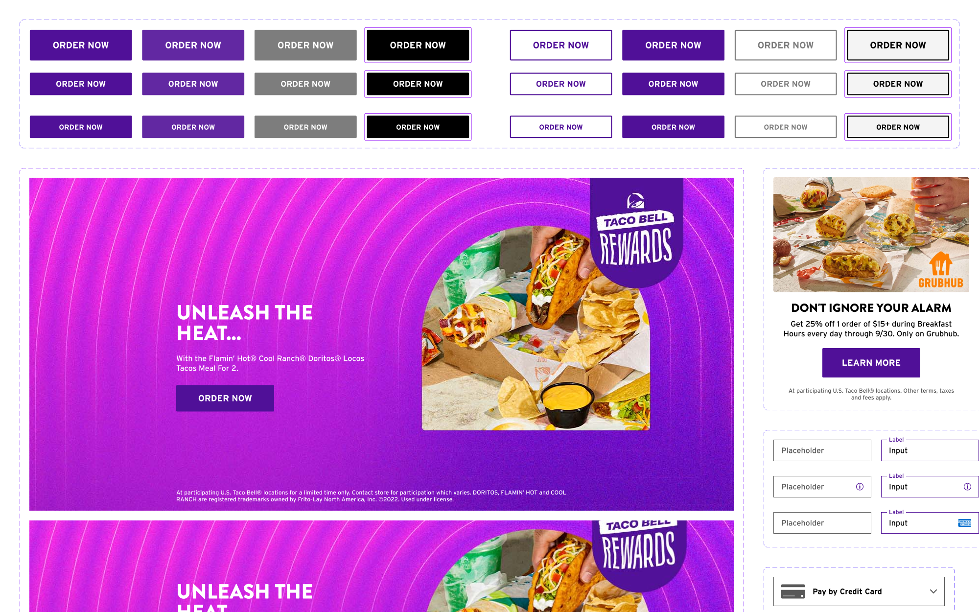
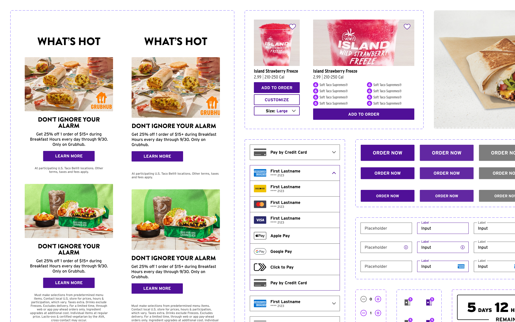
Downstream from the Brand library, each platform (app, web, and kiosk) has its own library, housing any styles and components specific to that platform. Following atomic design principles, the smallest building blocks (such as buttons, checkboxes, or input fields) are built out as Atom components, utilizing Figma-specific features such as auto-layout, variants, and properties to make them as flexible and easy to use as possible. Atoms are then combined into Molecules, larger components such as promo cards or cart listings. Organisms are one size bigger are the most complex components, combining both Atoms and Molecules into blocks such as a hero module or menu product listing. We also built out Templates, incorporating key navigation patterns and slot components that let designers quickly replicate and build new features and screens without having to start from scratch every time.
As a project designed to get teamwide buy-in, we didn’t have engineering support or even most of the historic design artifacts used to build screens and features. We manually rebuilt every style and component from all platforms (often using screenshots of app and kiosk and inspecting elements on the website), making sure to correct and align things like fonts, spacing, and colors along the way (bye bye eleven random shades of purple) to create unified design patterns. This ensured that future usage of every component would be aligned with the overall brand, making design more consistent and collaboration and handoff with engineering as easy as possible.


Figma Plugin
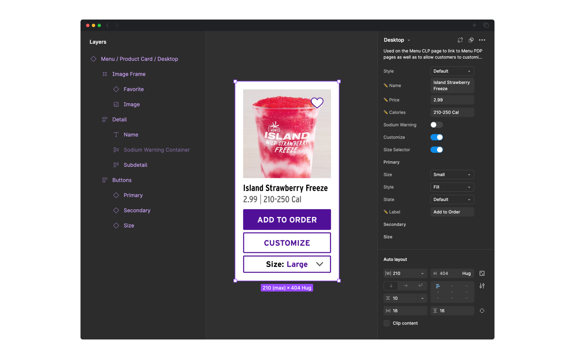
Introducing Chalupa, a plugin using real menu data to design.
Now that we had a design system and everything was looking aligned, we ran into another major hurdle – screens and features were often designed with mock or placeholder data and imagery, so stakeholders and decision-makers were getting caught up in those minor details instead of focusing on the overall project. We’re Taco Bell, we have all of the real menu data, why can’t we bring that directly into our designs?
We built an in-house Figma plugin, named Chalupa, to do exactly that. Pulling from the live national menu (the same one used on the website and app), the plugin is able to fetch names, prices, calories, and product photography. Paired with the design system, it allows designers to instantly populate their designs with their favorite tacos and crunchwraps. Additionally, it almost eliminates time spent on more tedious design work – generating a full category of items, updating customizations to show ingredients, or even populating a cart or “You Might Like” listing with real products were all built in. Chalupa empowers us to design with real data every step of the way, making everything from rough wireframes to final handoff designs look and feel real.
Conclusion
Scaling design and transforming product velocity.
Across the brand and platform libraries, we built over 1,200 components. The impact was immediate across the entire product team, with an average of 12,000 instances used weekly and over 552,000 instances used over the course of the year. The design system ensured new products and features were visually aligned with their platforms, as well as serving as a resource point for designers who needed to create new patterns as the product expanded. Additionally, there was a dramatic impact on product velocity – being able to quickly pull regularly used patterns like cards and buttons let design experiment, test, and build more efficiently without needing to start from scratch every time.
After launch, we also saw unexpected impacts across the entire brand. While originally designed just for product team use, having a design system also allowed brand creative and marketing to use components to ensure our website, app, and kiosk were accurately represented and promoted. With such large team and leadership buy-in and understanding, the in-house product design team was even expanded, building out a separate design system focused team and structure dedicated entirely to continuing to build out, update, and document the system.
- 1.2K+ components created across all platforms.
- 12K+ instances used every week.
- 552K+ instances used in the past year.