All screens, wireframes, and prototypes were designed with Figma. Customer experience flows were designed with FigJam. Animations were designed with Figma and Lottielab.
The Taco Bell Rewards program was broadened from app-only to include kiosk and drive-thru, enabling customers to earn and redeem rewards no matter how they ordered. With bright gradients, bold typography, and delightful animations, the unified visual experience drove overwhelming customer satisfaction and earned strong support from the C-suite.
- 2M+ successful orders within the first 90 days.
- 91% of customers will check in again in the future.
- 75% of customers had increased positive impressions of Taco Bell.
Introduction
Order más. Earn más. Everywhere.
For almost a decade, the Taco Bell Rewards program has been one of the most popular loyalty programs in the quick service restaurant space, allowing customers to earn points on every order then use those points to get free tacos and crunchwraps.
The problem? That only worked for digital app users. Customers ordering via the kiosk at their local store could enter their email to earn points (when it worked), but weren’t able to take advantage of their rewards or offers. Drive-thru was even harder, requiring physically scanning the receipt in the app to earn points (and again not being able to use them when ordering from the driver’s seat).
With approximately 42 million Taco Bell customers each week and only 28 million app users, there was a clear opportunity to grow and expand the Rewards program, ensuring that everyone could use it – no matter where they ordered. Customers using the kiosk or drive-thru should be able to “check in & earn” to automatically earn points, redeem rewards, order early access items, and pay with their stored card, just as app customers have always been able to do.
Customer Experience
Cross-functional collaboration to redefine the ordering experience.
An internal team was built to tackle the problem, consisting of stakeholders from over 25 departments, ranging from marketing and product to customer middleware and legal. We quickly created an internal weekly cadence to determine plans & scope, review work in progress, and actually get the work done to meet milestones.
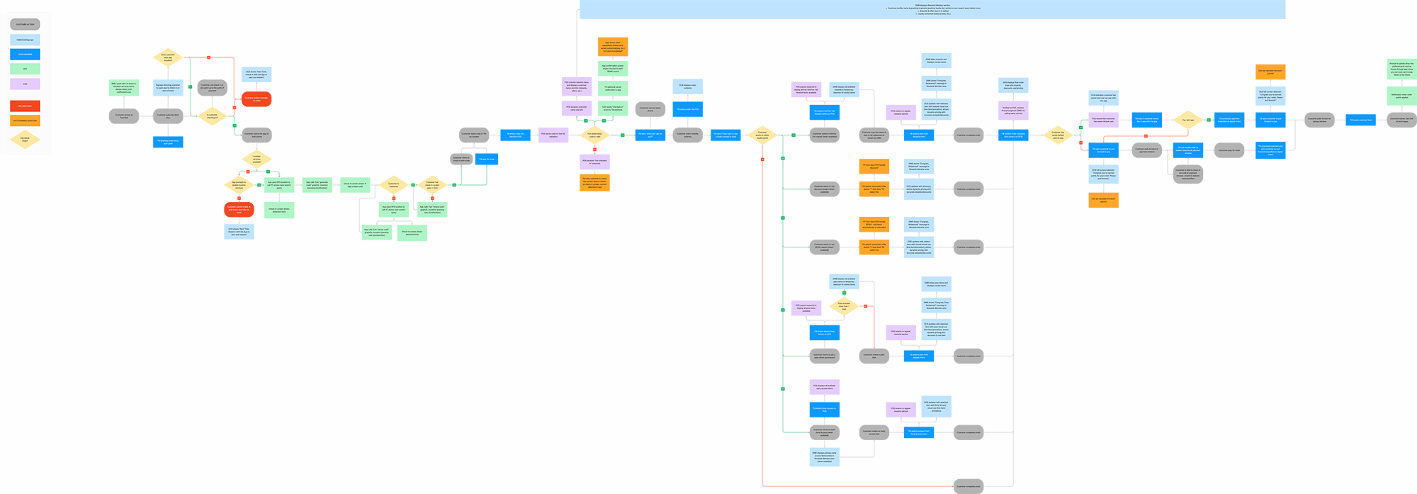
Our first hurdle was figuring out, from beginning to end, what the customer experience would even be. We had a vague idea that customers would somehow use the app to check in at the store when ordering, but how? What would happen next? What systems would do what?
To solve, all stakeholders collaborated synchronously and asynchronously in a shared FigJam environment, detailing the customer experience flow in the drive-thru from the moment they pull up to the moment they drive away with their food. The flow categorized each step and decision point by the system it affected, whether it was a customer action, team member, app, drive-thru menu board, point-of-sale system, or backend. This allowed us to identify the needs, decisions, training, and failure points across various platforms, teams, and roles before any design was started or code was written.
Wireframes
Rapid iteration to create a seamless end-to-end flow.
With the weekly cadence in place and end-to-end customer experience flow mapped out, we were able to quickly iterate on user experience, content hierarchy, and overall direction in wireframes.
Working in a shared Figma space (with key deliverables separated into organized pages and key milestones), we leveraged Figma comments for quick feedback or copy changes and Jira tickets to track larger changes or functionality requirements. This allowed all stakeholders to participate and provide feedback throughout the project, while also documenting and recording any changes in needs or limitations for posterity and handoff.
Extending the existing Taco Bell platform patterns, we created mid-fidelity wireframes and user flows for every step and screen across the app, kiosk, and drive-thru menu board, tying each flow to a key milestone or decision point in the customer experience. Working in mid-fidelity allowed us to iterate quickly with “real” content and data without getting bogged down in specific design details. Additionally, building wireframes this way enabled us to quickly prototype and conduct user tests, gathering valuable customer feedback from the very beginning.
User Testing
Designing smarter and validating insights with user testing.
Integrating the user research and consumer insights stakeholders directly into the core team allowed us to run quick user tests to validate assumptions or find better ways of solving problems.
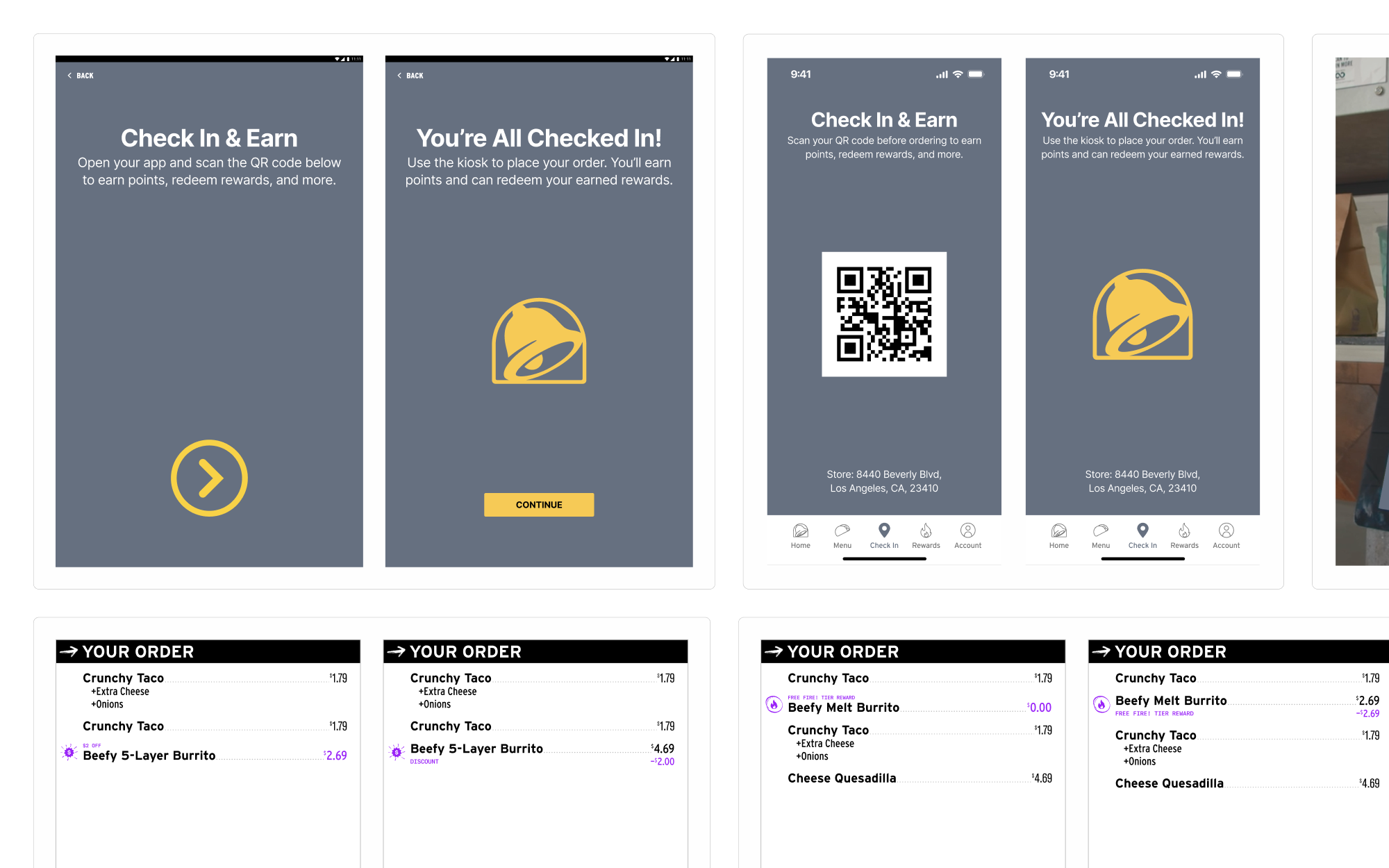
User tests included everything from the best method of checking in on the kiosk (customers preferred a 4-digit code to scanning a QR code from their phone) to how customers best scan and understand discounts shown on the drive-thru menu board (customers preferred seeing the original price and discount listed instead of only seeing the final price). These user tests were conducted using quick wireframes or design sketches in Figma prototypes, aiming to address core problems or questions before investing time in visual design.
Design
Creating a unified visual language across three platforms.
With the program touching three different platforms (all with existing and different styles and structures), we needed to create a new unified style to ensure consistency for customer familiarity. Building off of the existing baseline Rewards program styles, we added brighter colors and gradients, bold condensed poster-style type, a suite of icons and animations, and even a scrolling marquee to create a whole new visual language for the brand. Beyond the visual language, we established copy guidelines – short, to the point statements written in a sentence style for easy scanning and parsing. The new style stands out whether it’s on a digital screen or a printed sign and was designed to be flexible, accounting for everything from small handheld landing pages with program details and FAQs to large 55” digital menu boards celebrating a customer checkout.
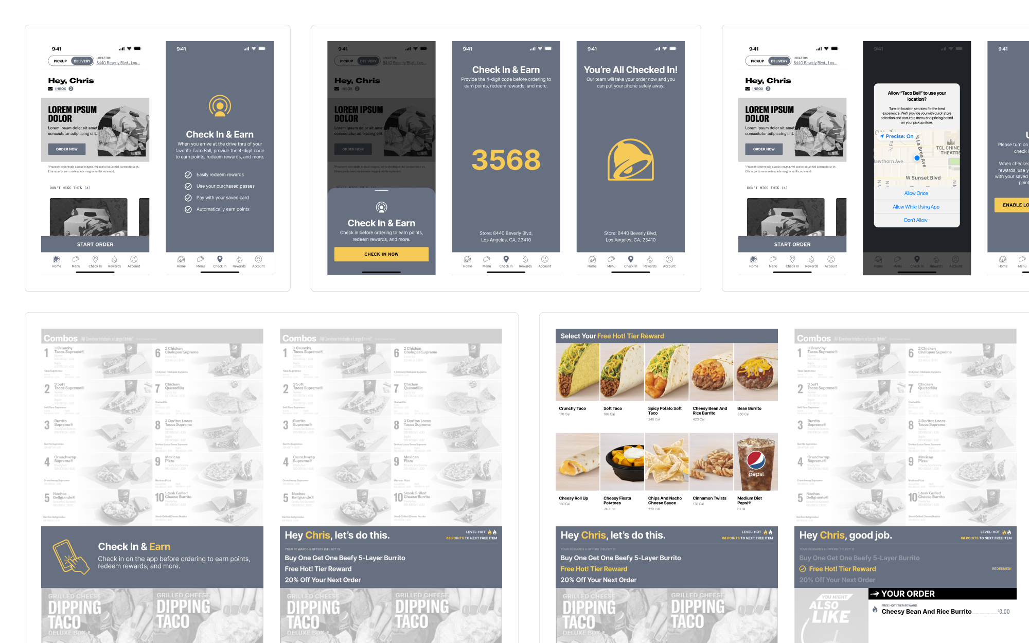
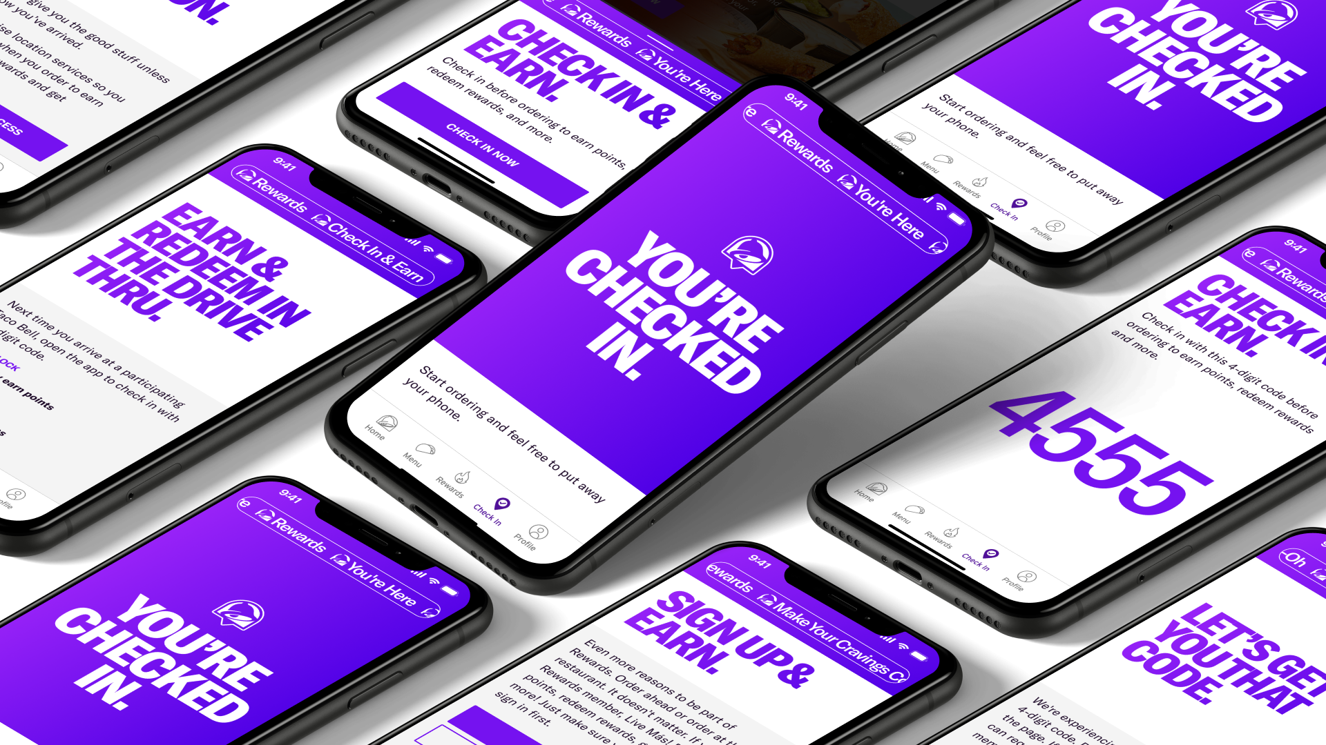
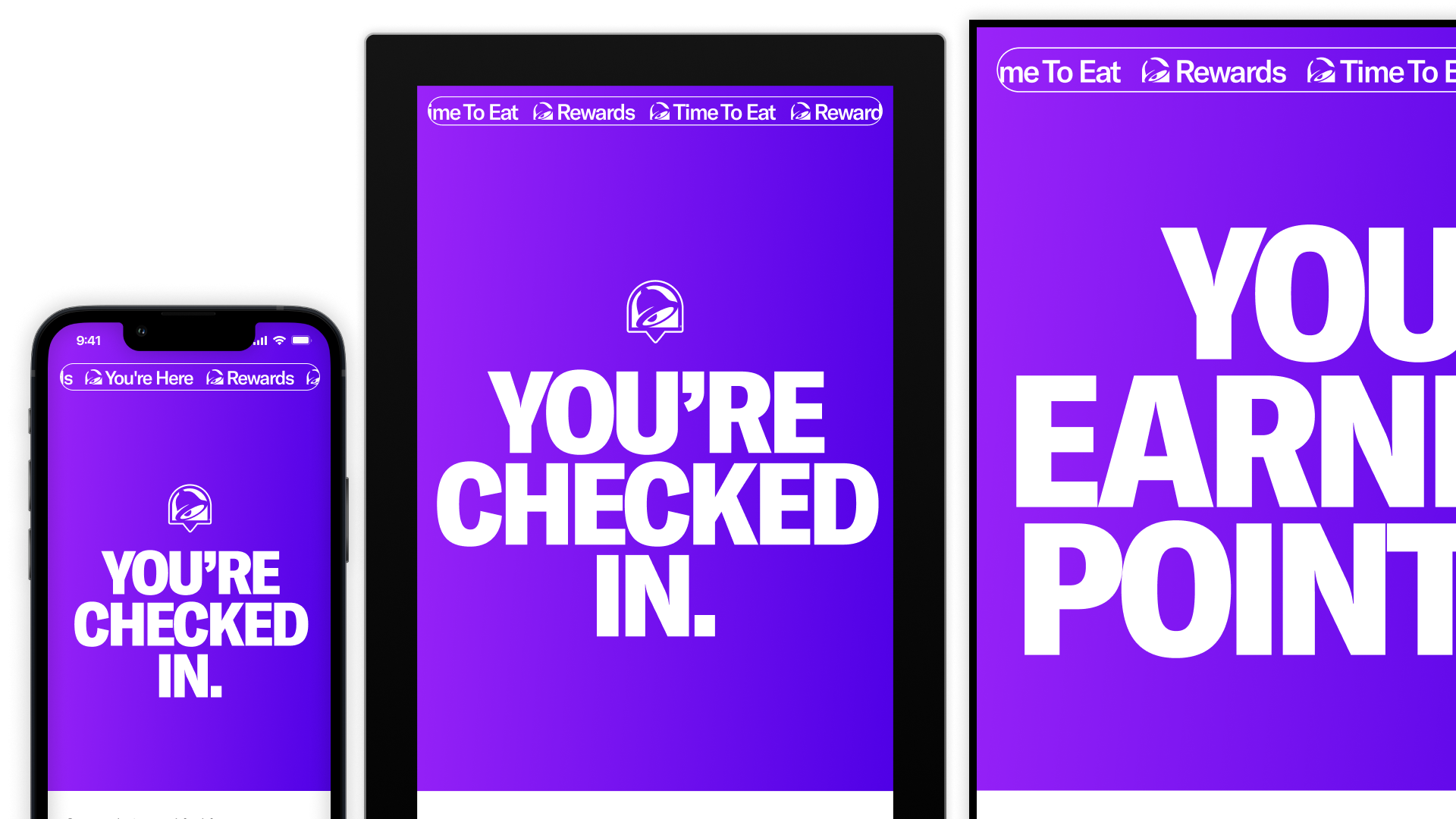
For customers, the app is the entry point to the entire experience – Rewards members near a store would open the app to see a 4-digit code that allowed them to check in at the kiosk or drive-thru. Customers with their locations on see a new bottom sheet immediately upon opening the app, reducing the steps necessary to see the code and start earning points. A marquee animation scrolls across the page horizontally celebrating “You’re Here.” Upon completing check in, a bright gradient takeover and large type animation brings an element of delight to the ordering experience.
Design
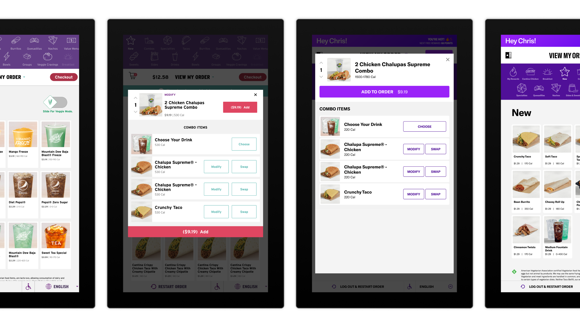
On kiosk, we took the opportunity to “freshen up” the entire platform. The kiosk was using outdated salmons and teals, remnants of an old Taco Bell brand style, so we replaced them with our brand purples and violets (along with updated fonts and other styles) to mirror the app, keeping a consistent ordering experience for customers across platforms. A bold “You’re Here” marquee and headline banner was added to the main splash screen, inviting existing customers to sign in and new customers to learn more about the Rewards program. Upon successful check in, the same successful gradient takeover and animation from the app fills the screen, connecting the app and kiosk experiences. Once checked in, customers unlock a new category on the menu, allowing them to order their rewards and take advantage of their offers from anywhere in the ordering flow.
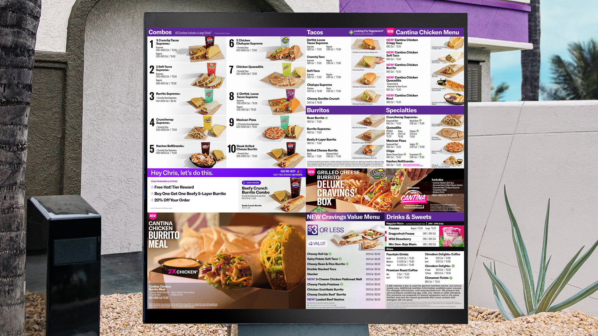
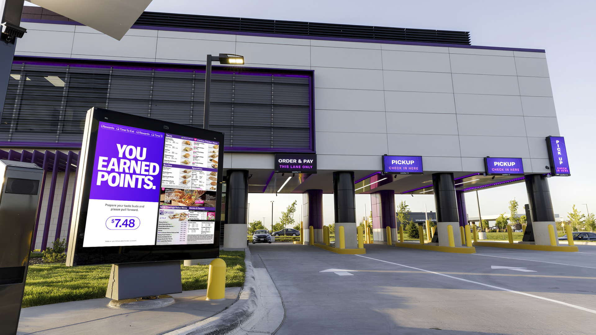
Our focus on the drive-thru menu board was getting folks the information they needed as fast as possible and as organized as possible (nobody wants to sit in line behind the person trying to figure out how many tacos to order). With limited space to present the information (in case you were wondering, Taco Bell sells around 77 unique items), we focused on a key information hierarchy of name, Rewards tier, and displaying three available rewards or offers as easily as possible. When customers ask to use a Reward, a new top panel of the menu board opens up, displaying all available food options with details and photography. Once an order is completed, a full panel takeover appears, maintaining the same bright gradient and marquee visual language as the other platforms. This time, it's displayed on a giant 55" screen with a bold "YOU EARNED POINTS" message in all caps, not only celebrating the completed order but also teasing the program to customers in line behind.
Conclusion
Time for a hot streak.
The new “check in & earn” program rolled out to all 8,000+ Taco Bell stores nationwide throughout the second half of 2024 – first to drive-thru menu boards over the summer, with kiosk quickly following throughout the fall and winter.
Customer feedback was immediately overwhelmingly positive, with 91% of customers saying they would use the program again and 75% of customers saying the program increased their positive impressions of Taco Bell. Over 2 million customers had successful check-ins in the first 90 days alone, with the numbers only growing as time went on.
One of the highlights of the program has been the opportunity to connect team members and customers – team members are able to greet checked in customers by name in the drive thru, and one team member even sang happy birthday to a delighted customer when she pulled up.
The Taco Bell C-suite has repeatedly praised the program and its importance to the company, with the Chief Digital Transformation Officer presenting it to nationwide franchisees at the annual Franchise Management Advisory Council and to investors and Wall Street analysts at Yum! Investor Day.
With such a massive success, the Taco Bell team immediately began planning for a phase 2 of the program, allowing customers to use their subscription passes, re-order past orders, and even order their favorite items without needing to be glued to their phones.
- 2M+ successful orders within the first 90 days.
- 91% of customers will check in again in the future.
- 75% of customers had increased positive impressions of Taco Bell.