All work was designed with Sketch. InVision was used to prototype interactions. The fully responsive site was built using Mapbox, JavaScript, Gulp, and Sass on the WordPress content management system.
Griffith Observatory needed a modern, mobile-friendly website to replace its outdated and difficult-to-navigate platform. The redesigned site features improved navigation, interactive maps, and a dynamic day/night theme, creating an engaging and accessible experience for visitors from around the world.
Introduction
Exploring a universe of possibilities.
Griffith Observatory is one of the most iconic landmarks in Los Angeles, featured in such legendary films as Rebel Without A Cause, The Terminator, and La La Land. Opened in 1935, it is the world’s most popular public observatory and has welcomed over 85 million visitors to explore interactive exhibits on space and science, live shows, beautiful grounds, and an amazing view of the Hollywood sign, all for free.
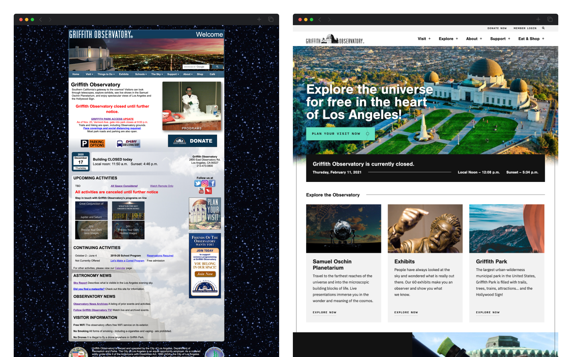
Their website receives tens of thousands of monthly visitors, a combination of people looking to visit the observatory and people looking to learn more about space and history, with huge spikes in traffic around astral events (eclipses, launches, etc.). Unfortunately for those visitors, the website was a huge roadblock to successfully learning more – over a decade old, static and hard to update, hundreds of random and confusing pages with low resolution photos, and, most importantly, not mobile friendly (especially important for visitors looking to learn more while on the go).
User Experience & Content Strategy
Using data to build a flexible & mobile-first platform.
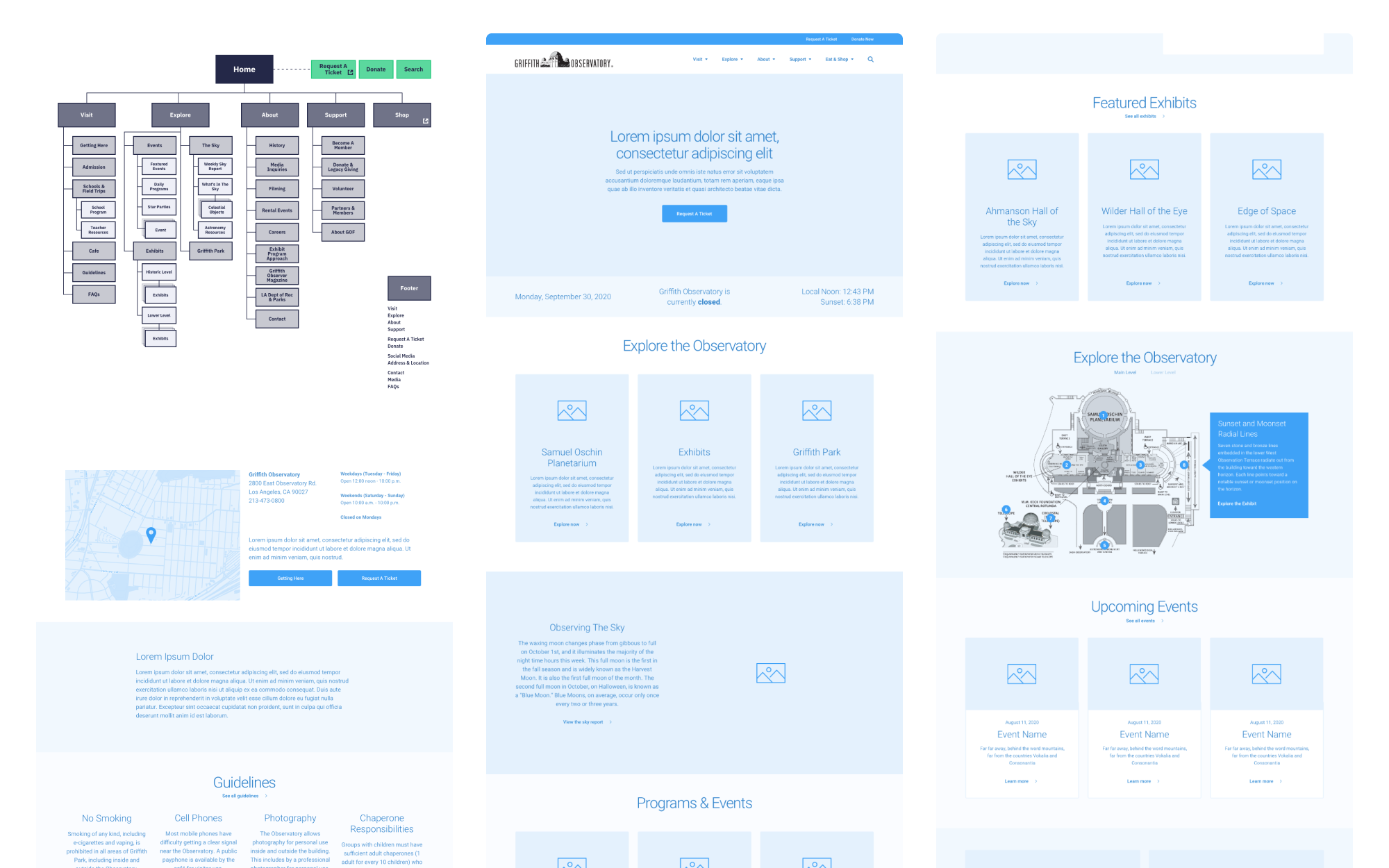
Working with the Griffith Observatory Foundation and the City of Los Angeles Department of Recreation and Parks, we started by creating a comprehensive and flexible content strategy.
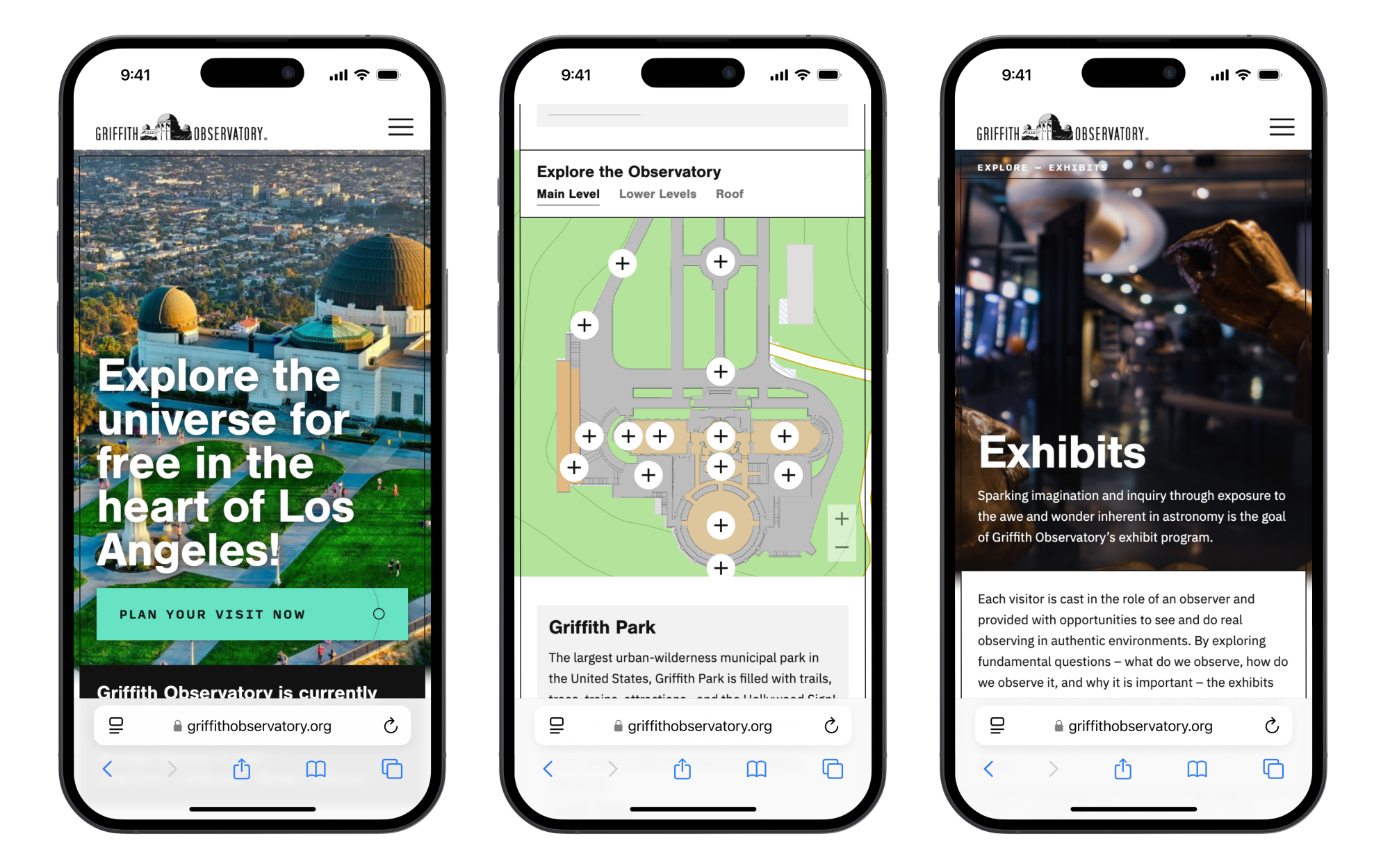
Using visitor analytics, we highlighted specific high level goals and built a mobile-friendly and modular structure on a content management system that allowed their team to not only help visitors quickly find what they needed, but also update, maintain, and grow the site in the future. Every old or lost page on the site was restructured, reorganized, and rebuilt to create clear user journeys throughout, with calls to action, breadcrumbs, and a structured content hierarchy.
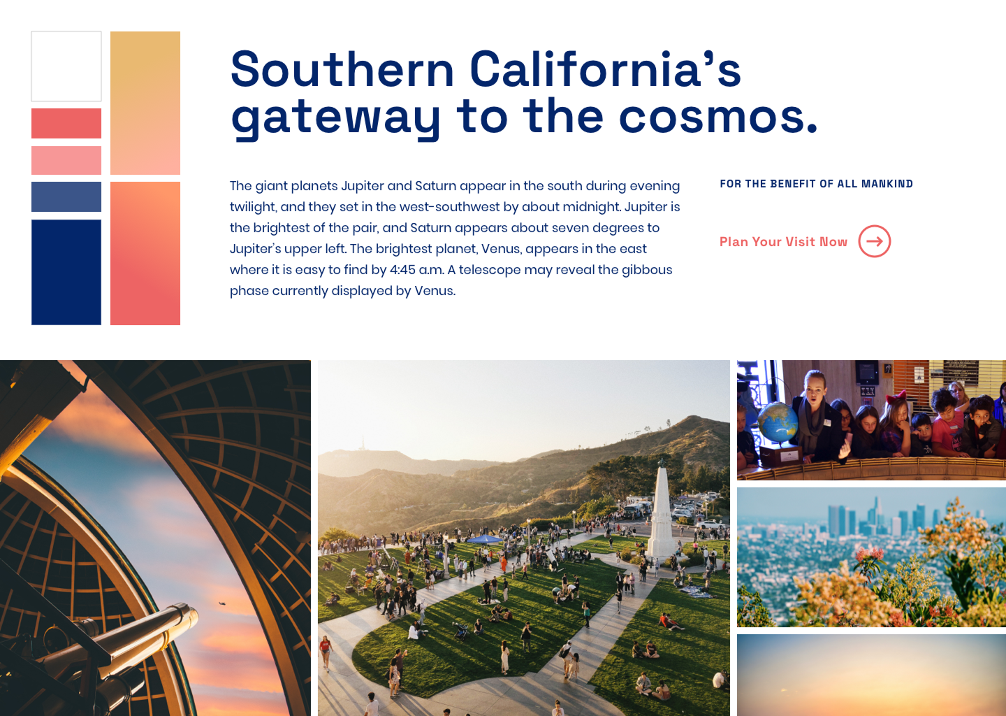
Design
Inspired by exploration, determined to delight.
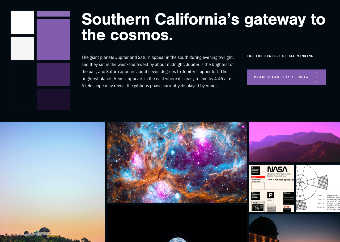
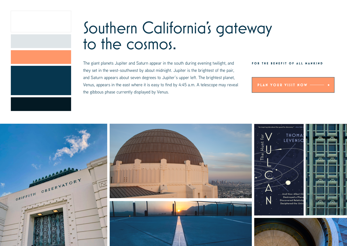
Three design directions were explored – the shades of sunset on the grounds, the mystery and magic of space exploration, and the detailed art deco architecture all served as points of inspiration. We wanted to highlight how beautiful and inspiring Griffith Observatory truly is, incorporating brighter and more exciting colors, huge photos focusing not only on the observatory but also on people interacting with the exhibits, and adding moments of delight throughout.
For that delight, we started small. Calls to action incorporate planetary orbit lines with hover effects and constellation charts add decorative elements while avoiding cliché patterns or boring stock photography. Thinking bigger, we built interactive maps that allowed visitors to explore and learn more about not only the grounds and surrounding area but also the interior floors and exhibits.


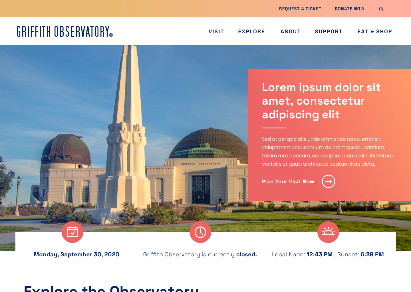
Interaction
Thinking outside the galaxy.
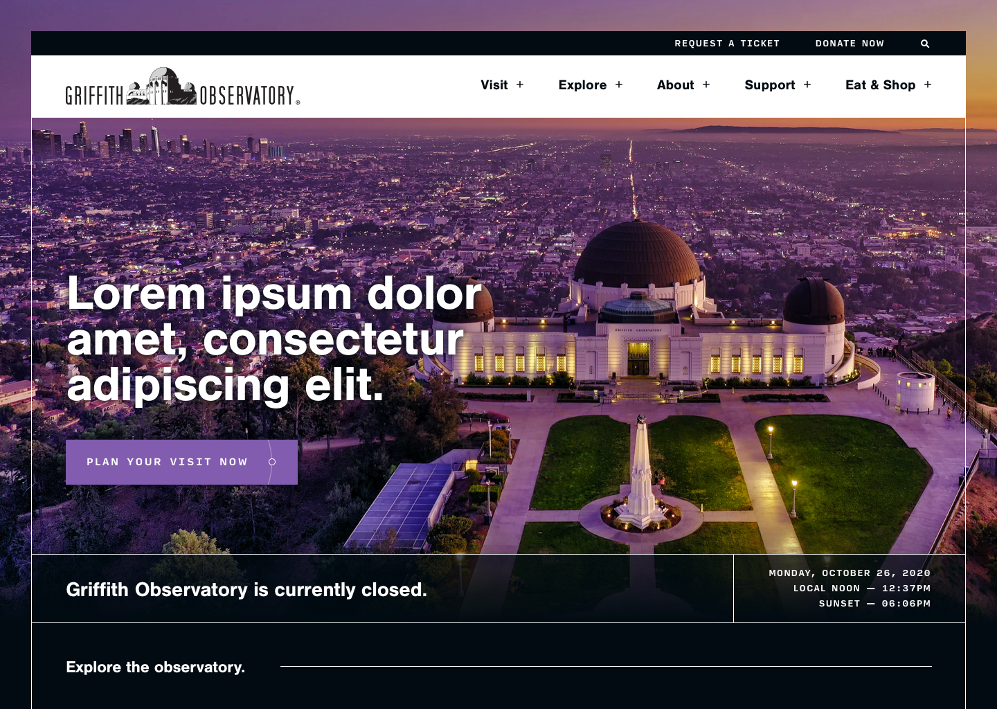
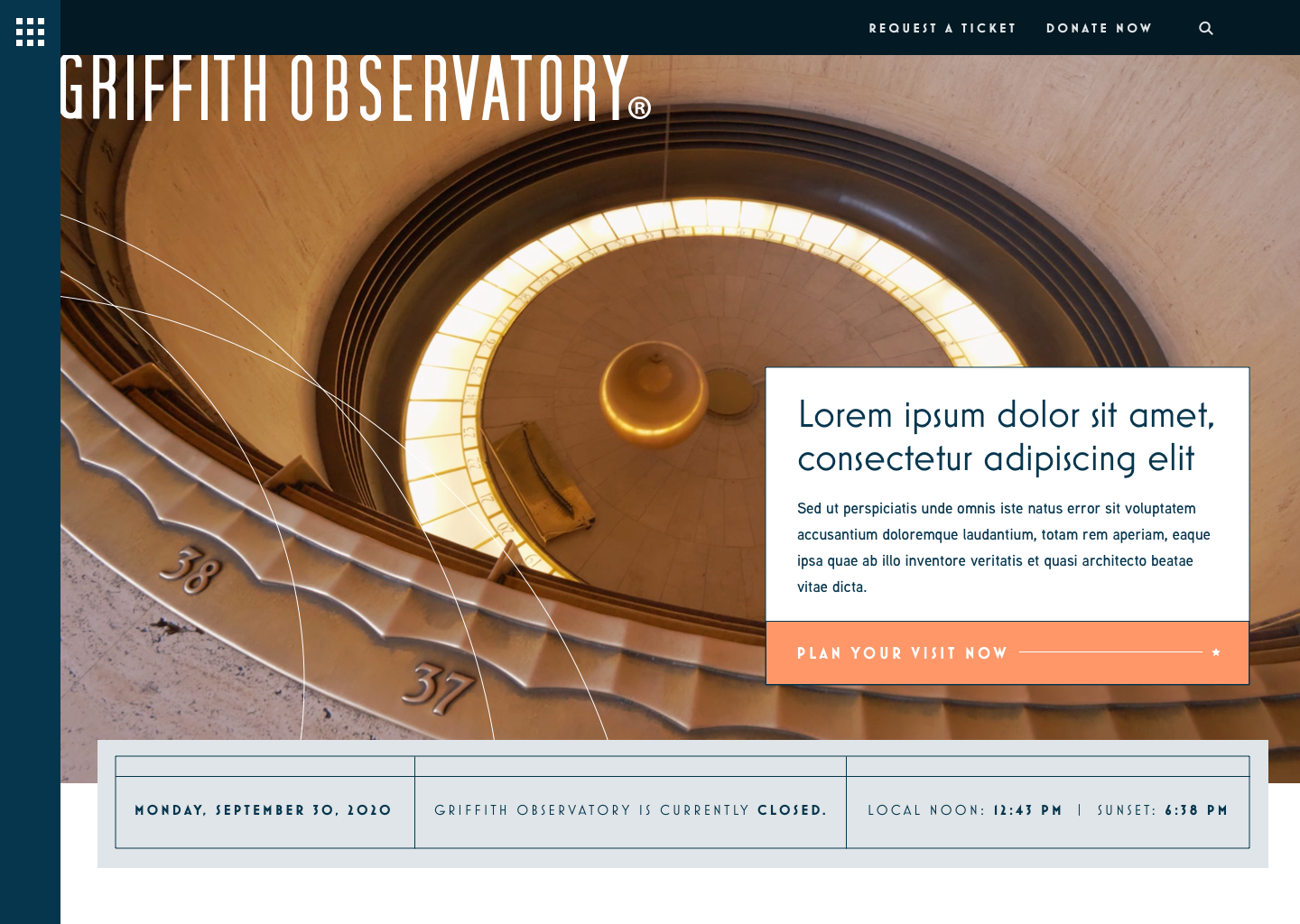
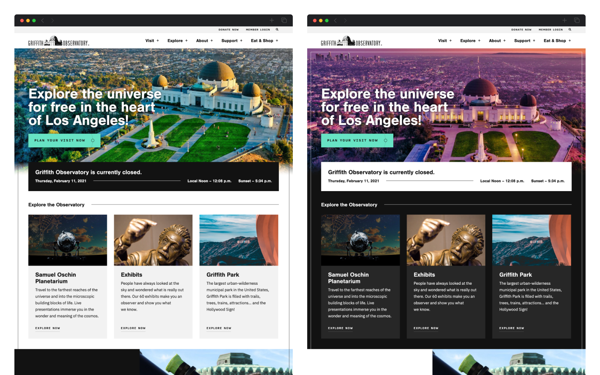
What if we leaned into the mystery and wonder of the observatory and space by incorporating a day and night cycle to the site, changing the theme between a dark and light mode based on the visitor’s location and their local sunrise and sunset times? Using their IP address, we built just that, with the entire site visually changing – including stunning photos of the observatory in daylight and at night alternating between the two modes. A large information module atop the primary pages highlighted not only the day’s operating hours, but also local noon and sunset for the visitor’s location.
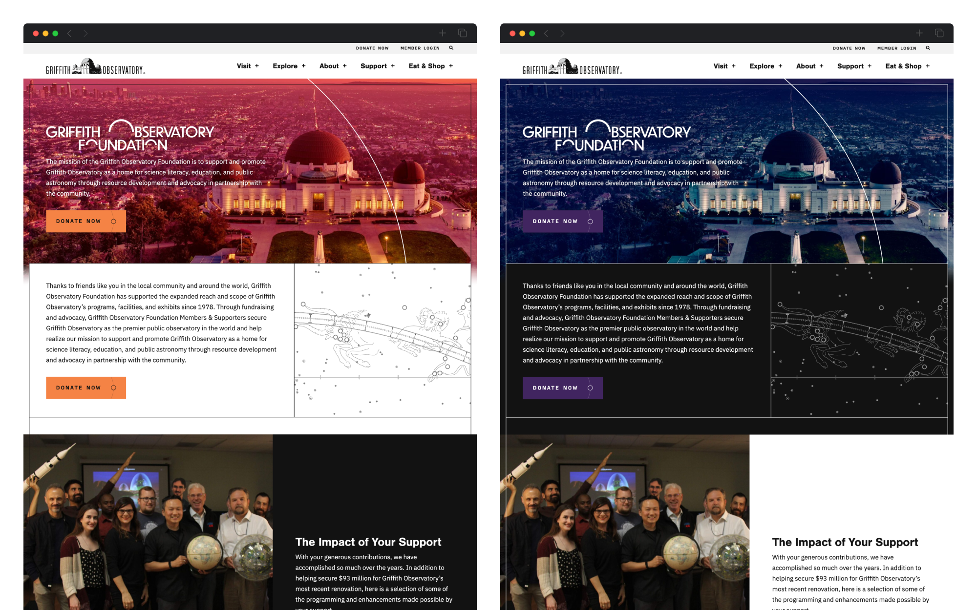
The dual color scheme was expanded for the Griffith Observatory Foundation, the non-profit partner of the observatory that works with the city and staff to promote it as an agent of science literacy and education. To differentiate the main observatory pages from foundation pages, an alternate color scheme and added decor elements are used throughout all foundation pages (including calls to action, navigation, and accents) to create a custom experience within the larger observatory site.
Conclusion
Gateway to the cosmos.
A year after launch, Mark Pine, the deputy director of Griffith Observatory, praised the site: “While the potential of the website was clearly evident at its outset, I can confirm that its reality and use has been transformative for our communication with our visitors. The fundamental design and organizational capabilities, the interface on phones, and the ability of the site to be expanded and refined have all been amazing. The site is very attractive, easy to navigate, and (critical to me) easy to update.”
Mark Pine Deputy Director, Griffith ObservatoryWhile the potential of the website was clearly evident at its outset, I can confirm that its reality and use has been transformative for our communication with our visitors.... The site is very attractive, easy to navigate, and ... easy to update.