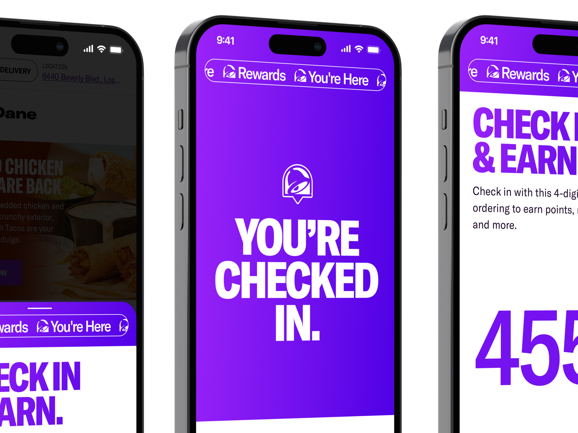
Taco Bell: Expanding the popular digital rewards program to in-store ordering nationwide.
The Taco Bell Rewards program was broadened from app-only to include kiosk and drive-thru, enabling customers to earn and redeem rewards no matter how they ordered. With bright gradients, bold typography, and delightful animations, the unified visual experience drove overwhelming customer satisfaction and earned strong support from the C-suite.
iOS / Android / Kiosk
Lead Product Design
2024
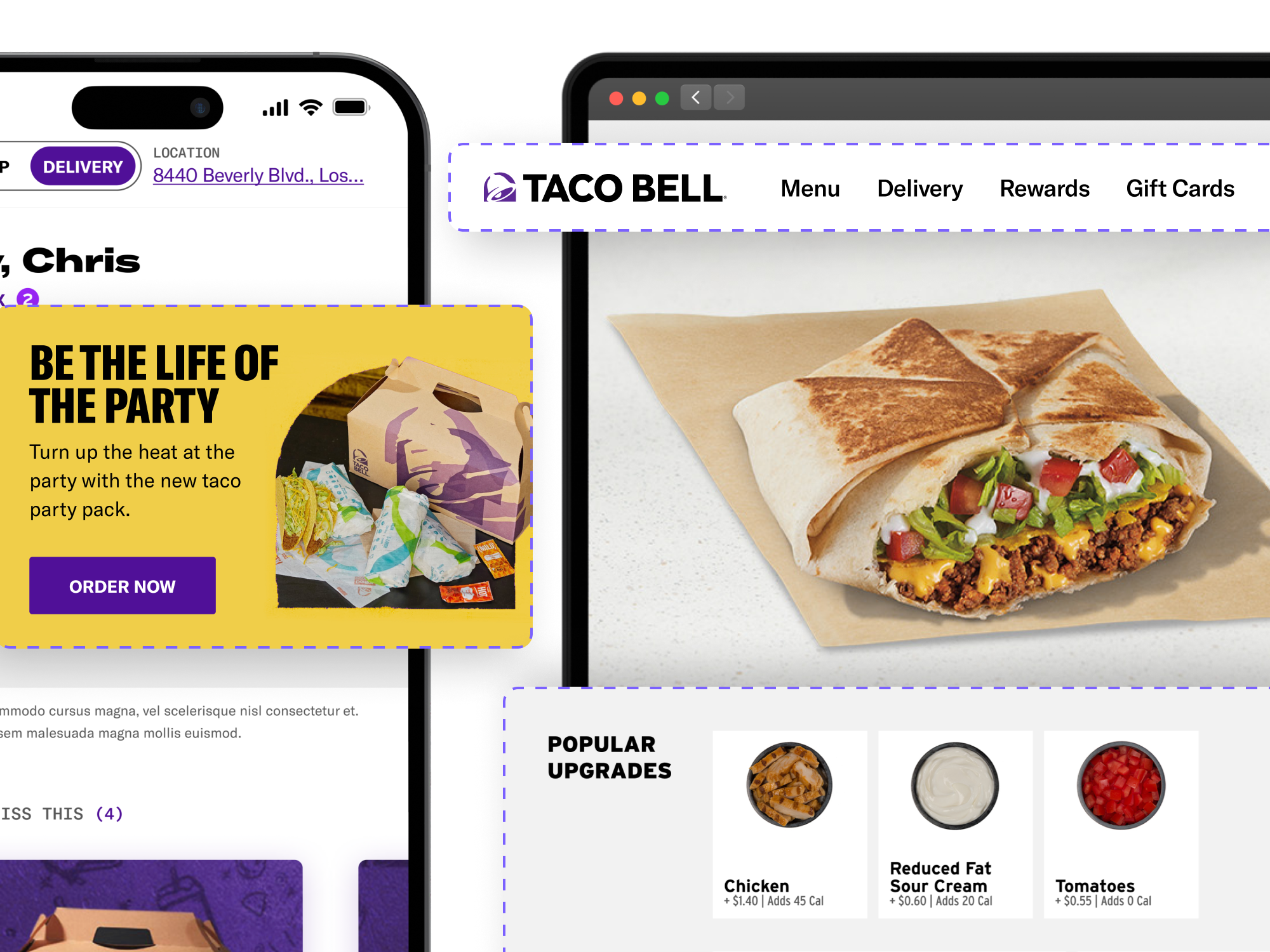
Taco Bell: Crafting a craveable atomic design system and Figma plugin.
Taco Bell’s fragmented design process led to inconsistencies across platforms. By building a comprehensive design system, complete with a structured component library and plugin for real menu data, the team transformed product velocity, improved brand consistency, and gained widespread adoption across product, marketing, and creative teams.
iOS / Android / Web
Lead Product Design / Code
2022
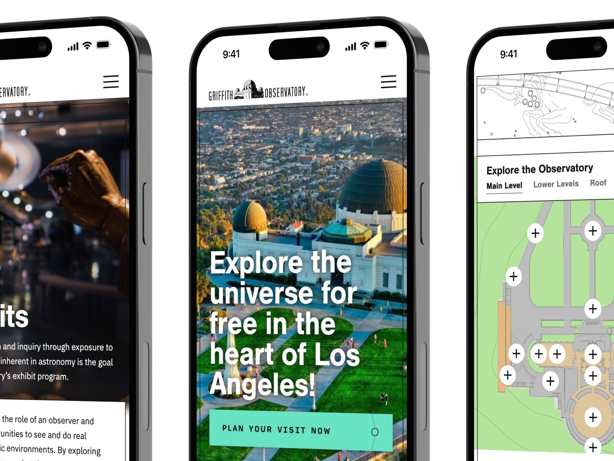
Griffith Observatory: Creating an out of this world experience for the iconic Los Angeles landmark.
Griffith Observatory needed a modern, mobile-friendly website to replace its outdated and difficult-to-navigate platform. The redesigned site features improved navigation, interactive maps, and a dynamic day/night theme, creating an engaging and accessible experience for visitors from around the world.
Web
Lead Design / Code
2021
Wolfenstein II: Marketing web experience for the anticipated sequel.
Dole & Disney: Interactive themed experiences to promote healthy eating.
DOOM: Marketing website design & strategy for a gaming classic.
Star Wars Galaxy: Interactive three-dimensional web experience.
NBC Sports: Social second-screen experience.
GIFFFFR: Animated GIF creation playground & web app.